


Раскрывающаяся открытка Санта-Клауса на CSS
2-ноября-2022, 22:52 285 0
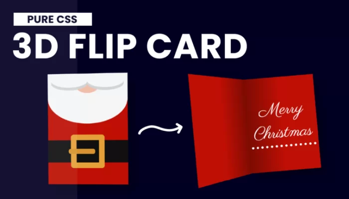
Раскрывающаяся открытка Санта-Клауса выполнена на CSS. Красивый эффектный блок для оформления вашего веб-ресурса к Рождеству. Исходники как всегда найдены в буржу-нете. Ниже приведён исходный код.
<!DOCTYPE html>
<html lang="en">
<head>
    <title>3D Santa Card</title>
    <link rel="preconnect" href="https://fonts.gstatic.com">
    <link href="https://fonts.googleapis.com/css2?family=Parisienne&display=swap" rel="stylesheet">
     <style>
        *,
        *:before,
        *:after{
            box-sizing: border-box;
            padding: 0;
            margin: 0;
        }
        body{
            background-color: #000022;
        }
        .card{
            height: 400px;
            width: 570px;
            position: absolute;
            margin: auto;
            left: 0;
            right: 0;
            top: 0;
            bottom: 0;
            cursor: pointer;
            transition: 2s;
            -webkit-perspective: 1200px;
                perspective: 1200px;

        }
        .card:hover{
            transform: rotate(-5deg);
        }
        .card:hover .outside{
            transform: rotateY(-130deg);
        }
        .outside{
            height: 100%;
            width: 50%;
            position: absolute;
            left: 50.1%;
            -webkit-transform-style: preserve-3d;
                transform-style: preserve-3d;
            transition: 2s;
            transform-origin: left;
        }
        .front,.back{
            height: 100%;
            width: 100%;
            position: absolute;
            backface-visibility: hidden;
            -webkit-backface-visibility: hidden;
            /*hide backface in firefox*/
            transform: rotateX(0deg);
        }
        .front{
            background-color: #BE0F04;
            z-index: 1;
        }
        .front:before{
            content: "";
            position: absolute;
            background-color: #101010;
            height: 80px;
            width: 100%;
            top: 240px;
        }
        .belt{
            height: 120px;
            width: 120px;
            border: 20px solid #E5A037;
            border-radius: 10px;
            position: absolute;
            margin: auto;
            left: 0;
            right: 0;
            top: 220px;
            z-index: 1;
        }
        .belt:after{
            content: "";
            position: absolute;
            width: 95px;
            height: 18px;
            background-color: #d6932e;
            top: 31px;
            right: 13px;
            border-radius: 8px;
        }
        .mouth{
            position: absolute;
            background-color: #EFBEAB;
            height: 50px ;
            width: 80px;
            z-index: 1;
            border-radius: 0 0 50% 50%;
            margin: auto;
            left: 0;
            right: 0;
            top: 20px;
        }
        .beard{
            background-color: #f5f5f5;
            position: absolute;
            width: 100%;
            height: 180px;
            border-radius: 0 0 50% 50%;
        }
        .beard:before,
        .beard:after{
            position: absolute;
            content: "";
            width: 130px;
            height: 50px;
            background-color: #f5f5f5;
            box-shadow: 0 10px #d3d3d3;
            border-radius: 0 0 50% 50%;
            top: -0px;
            z-index: 2;
        }
        .beard:before{
            left: 13px;
        }
        .beard:after{
            right: 13px;
        }
        .back{
            background: linear-gradient(
                to right,
                #BE0F04 50%,
                #7d0b03
            );
            transform: rotateY(180deg);
        }
        .inside{
            height: 100%;
            width: 50%;
            position: absolute;
            left: 50%;
            background: linear-gradient(
                to left,
                #BE0F04 50%,
                #7d0b03
            );
            font-family: 'Parisienne', cursive;
            color: white;
            font-size: 70px;
            text-align: center;
            line-height: 100px;
            padding: 90px 10px;
            box-shadow: 25px 25px 35px rgba(0,0,0,0.3);
        }
        .inside>p{
            border-bottom: 10px dotted white;
        }
     </style>
</head>
<body>
<div class="card">
<div class="inside">
    <p>Merry Christmas</p>
</div>
<div class="outside">
    <div class="front">
        <div class="belt"></div>
        <div class="mouth"></div>
        <div class="beard"></div>
    </div>
    <div class="back"></div>
</div>
</div>
</body>
</html>


Комментарии
all-
цитироватьТестируйте на 18 версии у кого есть возможность) если что подправим

 честно нет времени вообще. Ну вы еще ждёте?)) Я обновил, пробуйте
-
цитироватьТимофей, Мой взгляд, тогда у людей была Родина, было за что сражаться... и не важно какой был отдан приказ.... взять любой ценой... у меня два деда и две бабки были .. прошли всё это... они сделали это ради нас ... за нашу Родину!!! А наша Родина это наша Родина!


admin
27 мая 2025 21:56