


CSS анимация к Хеллоуину
2-ноября-2022, 23:06 399 0
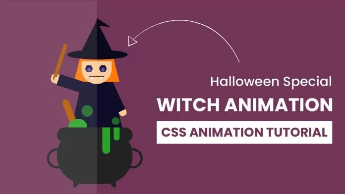
Красивая CSS анимация ведьмы варящей зелье к Хэллоуину. Анимация выполнена с использованием CSS. Ниже приведён код. Отличное решение к оформлению сайта перед Днем всех святых, а возможно и для выполнения иных задач.
HTML
<!DOCTYPE html>
<html lang="en">
    <head>
        <meta name="viewport" content="width=device-width, initial-scale=1.0" />
        <title>Witch Animation</title>
        <!-- Stylesheet -->
        <link rel="stylesheet" href="style.css" />
    </head>
    <body>
        <div class="container">
            <div class="witch">
                <div class="hair">
                    <div class="hat"></div>
                    <div class="face">
                        <div class="eye"></div>
                        <div class="mouth"></div>
                    </div>
                </div>
                <div class="cloak">
                    <div class="hand-l">
                        <div class="stick"></div>
                    </div>
                </div>
                <div class="hand-r"></div>
            </div>
            <div class="stick2"></div>
            <div class="bubbles">
                <div class="bubble-1"></div>
                <div class="bubble-2"></div>
            </div>
            <div class="claudron">
                <div class="handle"></div>
                <div class="stand"></div>
                <div class="potion"></div>
            </div>
        </div>
    </body>
</html>
CSS
body {
    padding: 0;
    margin: 0;
    background-color: #723457;
}
.container {
    position: absolute;
    width: 330px;
    height: 480px;
    margin: auto;
    left: 0;
    right: 0;
    top: 0;
    bottom: 0;
}
.witch {
    position: absolute;
    top: 100px;
    left: 110px;
}
.hair {
    height: 0;
    width: 80px;
    border-bottom: 80px solid #ff7903;
    border-left: 20px solid transparent;
    border-right: 20px solid transparent;
}
.hat {
    background-color: #0b081b;
    width: 160px;
    height: 25px;
    border-radius: 50%;
    position: relative;
    right: 38px;
    bottom: 5px;
}
.hat:before {
    content: "";
    position: relative;
    width: 0;
    height: 0;
    border-left: 50px solid transparent;
    border-right: 50px solid transparent;
    border-bottom: 100px solid #0b081b;
    bottom: 95px;
    left: 28px;
}
.hat:after {
    width: 0;
    height: 0;
    content: "";
    border-top: 10px solid transparent;
    border-bottom: 10px solid transparent;
    border-left: 40px solid #0b081b;
    position: absolute;
    right: 45px;
    bottom: 83px;
    transform: rotate(20deg);
}
.face {
    background-color: #ffcb9b;
    height: 60px;
    width: 80px;
    border-radius: 0 0 40px 40px;
    z-index: 1;
    position: relative;
}
.eye {
    background-color: #6155bd;
    height: 9px;
    width: 9px;
    border-radius: 50%;
    position: relative;
    top: 18px;
    left: 15.2px;
    box-shadow: 0 -3px 0 5px #1f1a43, 37px 0 0 0 #6155bd,
        37px -3px 0 5px #1f1a43;
}
.mouth {
    height: 2px;
    background-color: #000000;
    width: 40px;
    position: relative;
    left: 20px;
    top: 30px;
}
.mouth:before,
.mouth:after {
    content: "";
    position: absolute;
    width: 0;
    height: 0;
    border-left: 4px solid transparent;
    border-right: 4px solid transparent;
    border-top: 7px solid #ffffff;
    top: 2px;
}
.mouth:before {
    left: 4px;
}
.mouth:after {
    right: 4px;
}
.cloak {
    height: 0;
    width: 80px;
    border-bottom: 180px solid #0e0c29;
    border-left: 40px solid transparent;
    border-right: 40px solid transparent;
    position: relative;
    right: 20px;
}
.hand-l {
    background-color: #0e0c29;
    height: 30px;
    width: 70px;
    position: relative;
    right: 65px;
    bottom: 0;
    transform: rotate(20deg);
    transform-origin: right;
    animation: wave 2s infinite;
}
@keyframes wave {
    50% {
        transform: rotate(5deg);
    }
}
.hand-l:before {
    content: "";
    position: absolute;
    background-color: #ffcb9b;
    height: 25px;
    width: 20px;
    right: 70px;
    top: 2px;
    border-radius: 10px 0 0 10px;
}
.stick {
    background-color: #b35900;
    height: 100px;
    width: 10px;
    border-radius: 10px;
    position: relative;
    bottom: 80px;
    left: -15px;
}
.hand-l:after {
    content: "";
    position: absolute;
    background-color: #ffcb9b;
    height: 10px;
    width: 10px;
    border-radius: 15px;
    top: 10px;
    right: 71px;
}
.hand-r {
    background-color: #0e0c29;
    height: 80px;
    width: 30px;
    position: absolute;
    left: 90px;
    bottom: 98px;
    transform: rotate(-25deg);
}
.hand-r:before {
    content: "";
    position: absolute;
    background-color: #ffcb9b;
    height: 15px;
    width: 20px;
    border-radius: 0 0 15px 15px;
    left: 10px;
    top: 80px;
}
.stick2 {
    background-color: #b35900;
    height: 200px;
    width: 18px;
    border-radius: 25px;
    transform: rotate(23deg);
    position: relative;
    top: 220px;
    left: 210px;
    animation: mix 4s infinite;
}
@keyframes mix {
    50% {
        transform: translateX(-100px) rotate(-23deg);
    }
}
.bubble-1 {
    background-color: #29a329;
    height: 30px;
    width: 30px;
    opacity: 0.6;
    border-radius: 50%;
    position: relative;
    top: 130px;
    left: 130px;
    animation: move-up-1 3s 0.5s infinite;
}
@keyframes move-up-1 {
    100% {
        transform: translateY(-95px);
    }
}
.bubble-2 {
    background-color: #29a329;
    height: 20px;
    width: 20px;
    opacity: 0.6;
    border-radius: 50%;
    position: relative;
    top: 130px;
    left: 210px;
    animation: move-up-2 3.2s 1.5s infinite;
}
@keyframes move-up-2 {
    100% {
        transform: translateY(-90px);
    }
}
.claudron {
    background-color: #222222;
    height: 150px;
    width: 200px;
    position: relative;
    margin: auto;
    top: 50px;
    border-radius: 100px;
}
.claudron:before {
    content: "";
    position: absolute;
    background-color: #222222;
    height: 40px;
    width: 100%;
    border-radius: 50px;
}
.handle {
    background-color: transparent;
    height: 40px;
    width: 240px;
    border: 7px solid #222222;
    position: absolute;
    border-radius: 40px;
    margin: auto;
    left: -27px;
    top: 55px;
}
.stand,
.stand:before {
    height: 0;
    width: 5px;
    border-top: 15px solid #222222;
    border-left: 6px solid transparent;
    border-right: 6px solid transparent;
    position: absolute;
}
.stand {
    bottom: -10px;
    transform: rotate(20deg);
    left: 40px;
}
.stand:before {
    content: "";
    position: absolute;
    bottom: 35px;
    left: 90px;
    transform: rotate(-40deg);
}
.potion {
    background-color: #29a329;
    height: 70px;
    width: 20px;
    border-radius: 0 0 50px 50px;
    position: relative;
    bottom: 0;
    left: 120px;
}
.potion:before {
    content: "";
    position: absolute;
    height: 35px;
    background-color: #29a329;
    width: 15px;
    left: 30px;
    border-radius: 0 0 30px 30px;
}
.potion:after {
    content: "";
    position: absolute;
    background-color: #29a329;
    height: 22px;
    width: 50px;
    bottom: 70px;
    right: 60px;
    border-radius: 25px 25px 0 0;
}
Комментарии
all-
цитироватьТестируйте на 18 версии у кого есть возможность) если что подправим

 честно нет времени вообще. Ну вы еще ждёте?)) Я обновил, пробуйте
-
цитироватьТимофей, Мой взгляд, тогда у людей была Родина, было за что сражаться... и не важно какой был отдан приказ.... взять любой ценой... у меня два деда и две бабки были .. прошли всё это... они сделали это ради нас ... за нашу Родину!!! А наша Родина это наша Родина!


admin
27 мая 2025 21:56