


Рождественская открытка с прозрачным эффектом на HTML и CSS
2-ноября-2022, 22:35 358 0
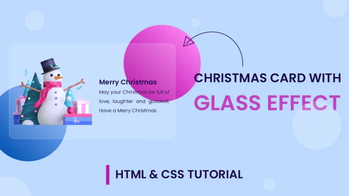
Красивая Рождественская карточка с потрясающим прозрачным эффектом для вашего веб-сайта. Используется HTML и CSS. Отлично подойдёт для оформления какого либо блока на новогодние праздники. Давайте взглянем на код.
HTML
<!DOCTYPE html>
<html lang="en">
  <head>
    <meta name="viewport" content="width=device-width, initial-scale=1.0" />
    <title>Glass Christmas Card</title>
    <!-- Google Font -->
    <link
      <link
      href="https://fonts.googleapis.com/css2?family=Poppins:wght@300;600&display=swap"
      rel="stylesheet"
    />
    <!-- Stylesheet -->
    <link rel="stylesheet" href="style.css" />
  </head>
  <body>
    <div class="container">
      <div class="shapes"></div>
      <div class="card">
        <img src="snowman-image.png" />
        <div class="text-container">
          <h2>Merry Christmas</h2>
          <p>
            May your Christmas be full of love, laughter and goodwill. Have a
            Merry Christmas .
          </p>
        </div>
      </div>
    </div>
  </body>
</html>
CSS
* {
  padding: 0;
  margin: 0;
  box-sizing: border-box;
  font-family: "Poppins", sans-serif;
}
body {
  background-color: #bddaff;
}
.container {
  height: 450px;
  width: 600px;
  position: absolute;
  transform: translate(-50%, -50%);
  left: 50%;
  top: 50%;
}
.shapes {
  height: 250px;
  width: 250px;
  background: linear-gradient(45deg, #b507a7, #fa80f0);
  border-radius: 50%;
  position: absolute;
  right: 0;
}
.shapes:before {
  content: "";
  position: absolute;
  height: 250px;
  width: 250px;
  top: 197px;
  background: linear-gradient(45deg, #0756b5, #80affa);
  border-radius: 50%;
  right: 347px;
}
.card {
  position: absolute;
  height: 300px;
  width: 550px;
  background-color: rgba(255, 255, 255, 0.15);
  border: 2px solid rgba(255, 255, 255, 0.2);
  transform: translate(-50%, -50%);
  top: 50%;
  left: 50%;
  border-radius: 8px;
  box-shadow: 0 0 40px rgba(0, 0, 0, 0.08);
  cursor: pointer;
  overflow: hidden;
}
.card img {
  position: absolute;
  width: 300px;
  filter: drop-shadow(0 0 20px rgba(26, 0, 68, 0.34));
  bottom: 0;
  left: 120px;
  transition: 0.5s;
}
.text-container {
  position: absolute;
  height: 100%;
  display: flex;
  flex-direction: column;
  justify-content: center;
  font-size: 14px;
  width: 250px;
  right: -250px;
  transition: 0.5s;
}
.card h2 {
  color: #1f0b50;
  text-transform: uppercase;
}
.card p {
  font-weight: 300;
  text-align: justify;
  color: #261844;
  line-height: 1.8;
  letter-spacing: 0.3px;
}
.card:hover img {
  width: 250px;
  left: 15px;
  bottom: 20px;
}
.card:hover .text-container {
  right: 15px;
}


Комментарии
all-
цитироватьТестируйте на 18 версии у кого есть возможность) если что подправим

 честно нет времени вообще. Ну вы еще ждёте?)) Я обновил, пробуйте
-
цитироватьТимофей, Мой взгляд, тогда у людей была Родина, было за что сражаться... и не важно какой был отдан приказ.... взять любой ценой... у меня два деда и две бабки были .. прошли всё это... они сделали это ради нас ... за нашу Родину!!! А наша Родина это наша Родина!


admin
27 мая 2025 21:56