


Рождественская анимация для сайта на CSS
27-ноября-2023, 20:48 28 0
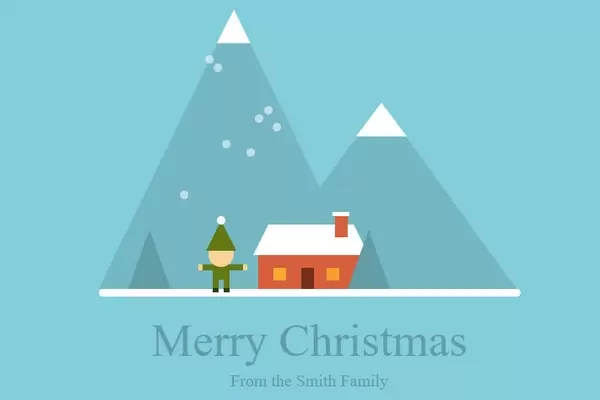
Рождественские сценки отлично подходят для ситуаций, когда вам нужно оформить свой сайт к новогодним праздникам и превратить свой блог в настоящее произведение искусства. Тем более, что можно осуществить красивую иллюстрации только с помощью HTML и CSS. Предлагаю вам красивую рождественскую анимацию для сайта. Анимация представлена в виде лёгкого дуновения ветра , то есть снежинки летят из стороны в сторону.Так же на иллюстрации присутствуют горы и мини ёлочки. Ну а так же прыгающим человечком. Код прост в установке. Приступим:
HTML
<div align="center" style="padding-top:350px;" class="fond">
<div class="contener_home_one">
<div class="fireplace"> </div>
<div class="fireplace_top"> </div>
<div class="triangle"> </div>
<div class="parallelogram"> </div>
<div class="door"> </div>
<div class="window_one"> </div>
<div class="window_two"> </div>
<div class="home_base"> </div>
<div class="christmas_tree"></div>
<div class="christmas_tree" style="left:-140px;"></div>
<div class="mountain_one"><div class="sub_mountain_one"> </div></div>
<div class="mountain_two"><div class="sub_mountain_two"> </div></div>
<div class="lutz">
<div class="lutin_pom"> </div>
<div class="lutin_top"> </div>
<div class="lutin_head"> </div>
<div class="lutin_arm1"> </div>
<div class="lutin_arm2"> </div>
<div class="lutin_body"> </div>
<div class="lutin_jb1"> </div>
<div class="lutin_jb2"> </div>
</div>
</div>
<div class="contener_snow">
<div class="snowflakes">
<div class="snowflake"> </div>
<div class="snowflake"> </div>
<div class="snowflake"> </div>
<div class="snowflake"> </div>
<div class="snowflake"> </div>
<div class="snowflake"> </div>
<div class="snowflake"> </div>
<div class="snowflake"> </div>
</div>
</div>
<div style=" width:500px;height:9px; background-color:#ffffff; border-radius:5px;"> </div>
<div style=" padding:5px; color:#639da8; font-weight:300; font-size:55px; font-family:'Roboto';padding-top:20px;">Merry <font style="font-weight:400;">Christmas</font></div>
<a href="http://texxsmith.com" style="text-decoration:none;" target="_blank"><div style=" color:#639da8; font-weight:300; font-size:20px; font-family:'Roboto';">From the Smith Family</div></a>
</div>CSS
.fond{position:fixed;padding-top:85px;top:0;left:0; right:0;bottom:0;
  background-color:#84cedb;}

.contener_home_one
{
  width: 150px;
  height: 76px;
  position:relative;
  z-index: 0;
}
.home_base
{
  position:absolute;
  bottom: 0px;

  background-color: #d75f3d;
  width:125px;
  left:14px;
  height: 40px;
}
.triangle {
  left: 8px;
  position:absolute;
  width: 0px;
  height: 0px;
  border-left: 18px solid transparent;
  border-right: 18px solid transparent;
  border-bottom: 36px solid #ffffff;
}
.parallelogram {
  left: 34px;
  position:absolute;
  width: 102px;
  height: 36px;
  -webkit-transform: skew(26deg);
  -moz-transform: skew(26deg);
  -o-transform: skew(26deg);
  background-color: #ffffff;
}
.door
{
  background-color: #742e1a;
  z-index: 1;
  width: 15px; height: 25px;
  position: absolute;
  bottom: 0px; left:65px;
}
.window_one
{
  background-color: #f9eb32;
  z-index: 1;
  width: 15px; height: 15px;
  position: absolute;
  bottom: 10px; left:32px;
  -webkit-animation: light 1.8s linear;
  -webkit-animation-iteration-count: infinite;
}
.window_two
{
  background-color: #f9eb32;
  z-index: 1;
  width: 15px; height: 15px;
  position: absolute;
  bottom: 10px; left:95px;
  -webkit-animation: light 1.4s linear;
  -webkit-animation-iteration-count: infinite;
  -moz-animation: light 1.4s linear;
  -moz-animation-iteration-count: infinite;
  -ms-animation: light 1.4s linear;
  -ms-animation-iteration-count: infinite;
  animation: light 1.4s linear;
  animation-iteration-count: infinite;
}
.christmas_tree
{
  right: -20px;
  position:absolute;
  bottom: 0px;
  width: 0px;
  height: 0px;
  border-left: 25px solid transparent;
  border-right: 25px solid transparent;
  border-bottom: 70px solid #639da8;
}
.mountain_one
{
  position:absolute;
  bottom: 0;
  z-index: -1;
  width: 0px;
  height: 0px;
  border-left: 160px solid transparent;
  border-right: 160px solid transparent;
  border-bottom: 220px solid #75b7c3;
}
.sub_mountain_one
{
  position:absolute;
  top: 0px;
  left:-30px;
  z-index: -1;
  width: 0px;
  height: 0px;
  border-left: 30px solid transparent;
  border-right: 30px solid transparent;
  border-bottom: 40px solid #ffffff;
}
.sub_mountain_two
{
  position:absolute;
  top: 0px;
  left:-20px;
  z-index: -1;
  width: 0px;
  height: 0px;
  border-left: 20px solid transparent;
  border-right: 20px solid transparent;
  border-bottom: 40px solid #ffffff;
}
.mountain_two
{
  position:absolute;
  left: -175px;
  bottom: 0;
  z-index: -1;
  width: 0px;
  height: 0px;
  border-left: 160px solid transparent;
  border-right: 160px solid transparent;
  border-bottom: 330px solid #75b7c3;
}
.fireplace
{
  background-color: #d75f3d;
  z-index: 1;
  width: 15px; height: 25px;
  position: absolute;
  top: -10px; right:30px;
}
.fireplace_top
{
  background-color: #ffffff;
  z-index: 1;
  width: 20px; height: 5px;
  position: absolute;
  top: -15px; right:28px;
}
@-webkit-keyframes light {
  0% {background-color: #f9eb32;}
  70% {background-color: #f9ac32;}
  10% {background-color: #f99032;}
}
@-moz-keyframes light {
  0% {background-color: #f9eb32;}
  70% {background-color: #f9ac32;}
  10% {background-color: #f99032;}
}
@-ms-keyframes light {
  0% {background-color: #f9eb32;}
  70% {background-color: #f9ac32;}
  10% {background-color: #f99032;}
}
.lutin_head
{
  background-color: #f7d496;
  width: 30px; height: 30px;
  border-radius: 50%;
  top: 20px; left:-45px;
  position: absolute;
  z-index: 1;
}
.lutin_body
{
  background-color: #637a15;
  width: 20px; height: 20px;
  top: 45px; left:-40px;
  position: absolute;
}
.lutin_jb1
{
  background-color: #637a15;
  width: 7px; height: 15px;
  top: 60px; left:-40px;
  border-bottom: 5px solid #323d0b;
  position: absolute;
}
.lutin_jb2
{
  background-color: #637a15;
  width: 7px; height: 15px;
  top: 60px; left:-27px;
  border-bottom: 5px solid #323d0b;
  position: absolute;
}
.lutin_arm1
{
  background-color: #637a15;
  width: 23px; height:7px;
  top: 47px; left:-57px;
  border-left: 5px solid #f7d496;
  position: absolute;
}
.lutin_arm2
{
  background-color: #637a15;
  width: 23px; height:7px;
  top: 47px; left:-27px;
  border-right: 5px solid #f7d496;
  position: absolute;
}
.lutin_top
{
  top: -5px; left:-48px;
  width: 0px; height: 0px;
  border-left: 18px solid transparent;
  border-right: 18px solid transparent;
  border-bottom: 36px solid #637a15;
  position: absolute; z-index: 2;
}
.lutin_pom
{
  background-color: #ffffff;
  width: 10px; height: 10px;
  border-radius: 50%;
  top: -10px; left:-35px;
  position: absolute;
  z-index: 3;
}
.lutz
{
  position: relative;
  -webkit-animation: lutz 0.4s linear;
  -webkit-animation-iteration-count: infinite;
  -moz-animation: lutz 0.4s linear;
  -moz-animation-iteration-count: infinite;
  -ms-animation: lutz 0.4s linear;
  -ms-animation-iteration-count: infinite;
  animation: lutz 0.4s linear;
  animation-iteration-count: infinite;
}
@-webkit-keyframes lutz {
  0% {bottom:0px;}
  70% {bottom:10px;}
  10% {bottom:0px;}
}
@-moz-keyframes lutz {
  0% {bottom:0px;}
  70% {bottom:10px;}
  10% {bottom:0px;}
}
@-ms-keyframes lutz {
  0% {bottom:0px;}
  70% {bottom:10px;}
  10% {bottom:0px;}
}
@keyframes lutz {
  0% {bottom:0px;}
  70% {bottom:10px;}
  10% {bottom:0px;}
}
.snowflakes {

  top: 0px;
  width: 100px;
  right: 0;
  -webkit-animation: snowflakes 3s linear infinite;
  -moz-animation: snowflakes 3s linear infinite;
  -ms-animation: snowflakes 3s linear infinite;
  animation: snowflakes 3s linear infinite;
}

.contener_snow
{
  position: absolute;
  top: 70px;
  left:50%;
  margin-left:-150px;
}
.snowflake {
  background-color: #ffffff;
  width: 10px; height: 10px;
  border-radius: 50%;
}

.snowflakes .snowflake {
  position: relative;
}

.snowflake:nth-child(1) {
  -webkit-animation: snowflake 9s 0.2s ease-in-out infinite;
  -moz-animation: snowflake 9s 0.2s ease-in-out infinite;
  -ms-animation: snowflake 9s 0.2s ease-in-out infinite;
  animation: snowflake 9s 0.2s ease-in-out infinite;
  top: 20px;left: 50px;
}
.snowflake:nth-child(2) {
  -webkit-animation: snowflake 9s 0.2s ease-in-out infinite reverse;
  -moz-animation: snowflake 9s 0.2s ease-in-out infinite reverse;
  -ms-animation: snowflake 9s 0.2s ease-in-out infinite reverse;
  animation: snowflake 9s 0.2s ease-in-out infinite reverse;
  top: -50px;left: -20px;
}
.snowflake:nth-child(3) {
  -webkit-animation: snowflake 9s 0.2s ease-in-out infinite;
  -moz-animation: snowflake 9s 0.2s ease-in-out infinite;
  -ms-animation: snowflake 9s 0.2s ease-in-out infinite;
  animation: snowflake 9s 0.2s ease-in-out infinite;
  top: 20px;left: 60px;
}
.snowflake:nth-child(4) {
  -webkit-animation: snowflake 9s 0.4s ease-in-out infinite reverse;
  -moz-animation: snowflake 9s 0.4s ease-in-out infinite reverse;
  -ms-animation: snowflake 9s 0.4s ease-in-out infinite reverse;
  animation: snowflake 9s 0.4s ease-in-out infinite reverse;
  top: -60px;left: -10px;
}
.snowflake:nth-child(5) {
  -webkit-animation: snowflake 9s 0.3s ease-in-out infinite reverse;
  -moz-animation: snowflake 9s 0.3s ease-in-out infinite reverse;
  -ms-animation: snowflake 9s 0.3s ease-in-out infinite reverse;
  animation: snowflake 9s 0.3s ease-in-out infinite reverse;
  top: 30px;left: 30px;
}
.snowflake:nth-child(6) {
  -webkit-animation: snowflake 9s 0.4s ease-in-out infinite reverse;
  -moz-animation: snowflake 9s 0.4s ease-in-out infinite reverse;
  -ms-animation: snowflake 9s 0.4s ease-in-out infinite reverse;
  animation: snowflake 9s 0.4s ease-in-out infinite reverse;
  top: 10px;left: 0px;
}
.snowflake:nth-child(7) {
  -webkit-animation: snowflake 9s 0.2s ease-in-out infinite reverse;
  -moz-animation: snowflake 9s 0.2s ease-in-out infinite reverse;
  -ms-animation: snowflake 9s 0.2s ease-in-out infinite reverse;
  animation: snowflake 9s 0.2s ease-in-out infinite reverse;
  top: 60px;left: -50px;
}
.snowflake:nth-child(8) {
  -webkit-animation: snowflake 9s 0.3s ease-in-out infinite reverse;
  -moz-animation: snowflake 9s 0.3s ease-in-out infinite reverse;
  -ms-animation: snowflake 9s 0.3s ease-in-out infinite reverse;
  animation: snowflake 9s 0.3s ease-in-out infinite reverse;
  top: -40px;left: 40px;
}


@-webkit-keyframes snowflakes {
  from {-webkit-transform: translateY(0);opacity: 1;}
  50% {opacity: 0.7;}
  to {-webkit-transform: translateY(200px);opacity: 0;}
}
@-webkit-keyframes snowflake {
  0% {-webkit-transform: translateX(0);}
  25% {-webkit-transform: translateX(350px);}
  50% {-webkit-transform: translateX(0);opacity: 1;}
  75% {-webkit-transform: translateX(300px);}
  100% {-webkit-transform: translateX(0);}
}
@-moz-keyframes snowflakes {
  from {-moz-transform: translateY(0);opacity: 1;}
  50% {opacity: 0.7;}
  to {-moz-transform: translateY(200px);opacity: 0;}
}
@-moz-keyframes snowflake {
  0% {-moz-transform: translateX(0);}
  25% {-moz-transform: translateX(350px);}
  50% {-moz-transform: translateX(0);opacity: 1;}
  75% {-moz-transform: translateX(300px);}
  100% {-moz-transform: translateX(0);}
}
@-ms-keyframes snowflakes {
  from {-ms-transform: translateY(0);opacity: 1;}
  50% {opacity: 0.7;}
  to {-ms-transform: translateY(200px);opacity: 0;}
}
@-ms-keyframes snowflake {
  0% {-ms-transform: translateX(0);}
  25% {-ms-transform: translateX(350px);}
  50% {-ms-transform: translateX(0);opacity: 1;}
  75% {-ms-transform: translateX(300px);}
  100% {-ms-transform: translateX(0);}
}
@keyframes snowflakes {
  from {transform: translateY(0);opacity: 1;}
  50% {opacity: 0.7;}
  to {transform: translateY(200px);opacity: 0;}
}
@keyframes snowflake {
  0% {transform: translateX(0);}
  25% {transform: translateX(350px);}
  50% {transform: translateX(0);opacity: 1;}
  75% {transform: translateX(300px);}
  100% {transform: translateX(0);}
}
Комментарии
all-
цитироватьТестируйте на 18 версии у кого есть возможность) если что подправим

 честно нет времени вообще. Ну вы еще ждёте?)) Я обновил, пробуйте
-
цитироватьТимофей, Мой взгляд, тогда у людей была Родина, было за что сражаться... и не важно какой был отдан приказ.... взять любой ценой... у меня два деда и две бабки были .. прошли всё это... они сделали это ради нас ... за нашу Родину!!! А наша Родина это наша Родина!


admin
27 мая 2025 21:56