


Переключатель для сайта «Кошелёк или жизнь» на Хеллоуин
12-августа-2025, 20:51 21 0
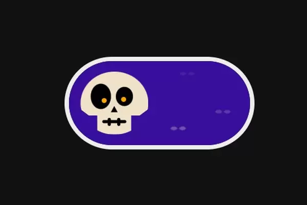
Переключатель для сайта Кошелёк или жизнь на Хеллоуин. Переход от черепа к конфете плавный. Данный переключатель можно использовать на сайте в преддверии Хеллоуина или украсить ваш тематический блог.
HTML(Pug)
.trick-or-treat
  input(type='checkbox')
  .trick-or-treat__backdrop
    .eyes
    .eyes
    .eyes
    .spot
    .spot
    .spot
  .trick-or-treat__toggle.toggle
    .toggle__body
      .toggle__eye.toggle__eye--left
      .toggle__eye.toggle__eye--right
      .toggle__nose
      .toggle__mouth
      .toggle__wrapper.toggle__wrapper--right
      .toggle__wrapper.toggle__wrapper--left
      .toggle__wrapper-shine
CSS(Stylus)
*
  box-sizing border-box

body
  background #111
  display flex
  min-height 100vh
  align-items center
  justify-content center

$transition = .35s
$sweet-main = #f62459
$sweet-secondary = lighten($sweet-main, 25%)
$skull = #f0e2c8
$checked-bg = dodgerblue
$unchecked-bg = darken(#4d13d1, 25%)

.trick-or-treat
  border-radius 100px
  overflow hidden
  height 100px
  position relative
  width 200px
  border 6px solid #eeeeee

  @media(min-width 768px)
    border 10px solid #eeeeee
    height 200px
    width 400px

  input
    cursor pointer
    height 100%
    width 100%
    opacity 0
    left 0
    top 0
    position absolute
    z-index 2

    &:checked
      ~ .trick-or-treat__toggle
        transform translate(100%, 0)

        .toggle__body
          $clip = polygon(-100% -100%, -100% -100%, -100% 200%, -100% 200%, -100% 200%, 200% 200%, 200% 200%, 200% 200%, 200% -100%, 200% -100%)
          clip-path $clip
          -webkit-clip-path $clip
          transform translate(-50%, -50%) rotate(585deg) scale(0.5, 0.4)
          background $sweet-main
          // horizontal / vertical radius
          border-radius 50% / 45%
          transition transform $transition, -webkit-clip-path $transition, clip-path $transition , background $transition, border-radius $transition

        .toggle__eye
        .toggle__eye:after
        .toggle__nose
        .toggle__mouth
        .toggle__mouth:after
        .toggle__mouth:before
          background $sweet-main

        .toggle__wrapper-shine
          opacity 1

      ~ .trick-or-treat__backdrop
        background $checked-bg

        .eyes:after
        .eyes:before
          background $checked-bg

        .spot
          animation-name scale
          background white


  &__backdrop
    background $unchecked-bg
    height 100%
    position absolute
    width 100%
    transition background $transition

  &__toggle
    height 100%
    left 0
    position absolute
    width 50%
    transition transform $transition

.toggle

  /* body is used for both the trick and treat main body */
  &__body
    position absolute
    height 75%
    width 75%
    background $skull
    border-radius 100%
    top 50%
    left 50%
    transition border-radius $transition, background $transition, -webkit-clip-path $transition, clip-path $transition, transform $transition
    transform translate(-50%, -50%) rotate(0deg) scale(1, 1)
    $clip = polygon(0 0, 0 60%, 12.5% 70%, 25% 70%, 25% 100%, 75% 100%, 75% 70%, 87.5% 70%, 100% 60%, 100% 0)
    -webkit-clip-path $clip
    clip-path $clip

  /* Skull eye */
  &__eye
    height 20%
    width 20%
    background black
    position absolute
    border-radius 50%
    top 40%
    left 50%
    transition background $transition

    &:after
      content ''
      position absolute
      height 5px
      width 5px
      background orange
      border-radius 100%
      transform translate(-50%, -50%)
      transition background $transition

      @media(min-width 768px)
        height 10px
        width 10px


    &--left
      height 40%
      width 30%
      transform translate(-50%, -50%) translate(-65%, 0)

      &:after
        bottom 15%
        left 65%

    &--right
      height 30%
      width 25%
      transform translate(-50%, -50%) translate(60%, 0)

      &:after
        bottom 10%
        left 45%

  /* skeleton nose */
  &__nose
    height 10%
    width 10%
    background black
    position absolute
    top 60%
    left 50%
    transform translate(-50%, -50%)
    transition background $transition
    $clip = polygon(0 100%, 50% 0, 100% 100%)
    clip-path $clip
    -webkit-clip-path $clip

  /* skeleton mouth*/
  &__mouth
    width 35%
    background black
    height 5%
    border-radius 4px
    position absolute
    bottom 15%
    left 50%
    transform translate(-50%, -50%)
    transition background $transition

    &:after
    &:before
      content ''
      position absolute
      width 35%
      height 100%
      border-radius 4px
      background black
      top 50%
      transform translate(-50%, -50%) rotate(90deg)
      transition background $transition

    &:after
      left 30%

    &:before
      left 70%

  &__wrapper
    position absolute
    top 50%
    background $skull
    width 50%
    height 120%
    transform translate(0, -50%)
    $clip = polygon(0 45%, 100% 0, 55% 35%, 100% 50%, 55% 65%, 100% 100%, 0 55%)
    -webkit-clip-path $clip
    clip-path $clip

    &--right
      left 100%

    &--left
      right 100%
      transform translate(0, -50%) rotate(180deg)

  &__wrapper-shine
    height 100%
    width 100%
    position absolute
    opacity 0
    border-radius 50% / 45%
    overflow hidden
    transition opacity $transition

    &:after
    &:before
      border-radius 50% / 50%
      content ''
      position absolute
      height 100%
      width 100%
      bottom 6%
      right 2%

    &:before
      background white

    &:after
      background $sweet-main
      bottom 10%
      right 2%
      height 110%
      width 110%


.eyes
  height 6px
  width 6px
  position absolute
  top 50%
  left 50%
  transform translate(-50%, -50%) scaleY(1)
  transform-origin center
  animation blink 4s infinite linear

  @media(min-width 768px)
    height 10px
    width 10px

  &:nth-of-type(1)
    top 15%
    left 65%
    opacity .1
    animation-delay 1s

  &:nth-of-type(2)
    top 80%
    left 60%
    opacity .4
    animation-delay 3s

  &:nth-of-type(3)
    top 60%
    left 85%
    opacity .25
    animation-delay 2s

  &:after
  &:before
    content ''
    background $skull
    border-radius 100% 0
    position absolute
    height 100%
    width 100%
    opacity .8
    top 50%
    left 50%
    transition background $transition

  &:after
    transform translate(-50%, -50%) translate(90%, 0) rotate(45deg)

  &:before
    transform translate(-50%, -50%) translate(-90%, 0) rotate(45deg)

.spot
  height 50px
  width 50px
  position absolute
  top 50%
  left 50%
  transform translate(-50%, -50%) scale(0)
  transform-origin center
  background $unchecked-bg
  border-radius 100%
  animation-duration 4s
  animation-iteration-count infinite
  animation-timing-function linear
  animation-fill-mode both
  transition background .5s

  &:nth-of-type(4)
    top 15%
    left 35%
    opacity .1
    animation-delay 1s

  &:nth-of-type(5)
    top 80%
    left 40%
    opacity .4
    animation-delay 3s

  &:nth-of-type(6)
    top 60%
    left 15%
    opacity .25
    animation-delay 2s

@keyframes blink
  9%
    transform translate(-50%, -50%) scaleY(1)
  10%
    transform translate(-50%, -50%) scaleY(0)
  11%
    transform translate(-50%, -50%) scaleY(1)
  12%
    transform translate(-50%, -50%) scaleY(0)
  13%
    transform translate(-50%, -50%) scaleY(1)

@keyframes scale
  from
    opacity 1
    transform translate(-50%, -50%) scale(0)
  to
    opacity 0
    transform translate(-50%, -50%) scale(1)


Комментарии
all-
цитироватьТестируйте на 18 версии у кого есть возможность) если что подправим

 честно нет времени вообще. Ну вы еще ждёте?)) Я обновил, пробуйте
-
цитироватьТимофей, Мой взгляд, тогда у людей была Родина, было за что сражаться... и не важно какой был отдан приказ.... взять любой ценой... у меня два деда и две бабки были .. прошли всё это... они сделали это ради нас ... за нашу Родину!!! А наша Родина это наша Родина!


admin
27 мая 2025 21:56