


Новогодний подарок на CSS
24-ноября-2023, 21:03 16 0
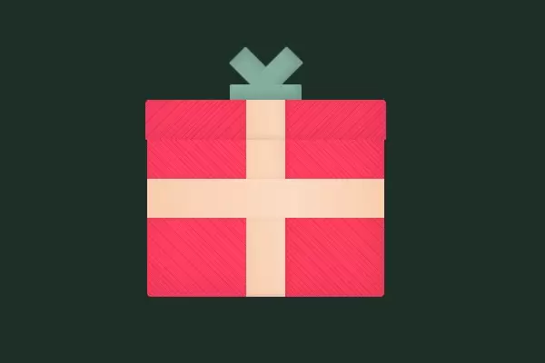
Новогодний подарок на CSS это красиво оформленная анимированная коробка. Когда вы наводите курсор мыши на закрытый ящик, Санта выпрыгивает из него. Идея проста, а реализация — чистый HTML и CSS. Общее впечатление фантастическое.
Pug
.present(ontouchstart)
  .santa
    .santa__hat
    .santa__eyes
    .santa__beard
      .santa__beard--cover
    .santa__smile
  .present__box
    .present__ribbon--vertical
    .present__ribbon--horizontal
  .present__top
    .present__ribbon--vertical
    .present__bow
SCSS
$colorBody: darken(#83AF9B, 45%);
$colorBow: #83AF9B;
$colorPresent: #FE4365;
$colorRibbon: #F9CDAD;
$sizeRibbon: 5vw;

$colorSantaFace: #E1B899;
$colorSantaEye: #111111;
$colorSantaSmile: $colorSantaEye;
$colorSantaHat: darken($colorPresent, 10%);

@mixin presentColors($direction: 45deg) {
  background-color: $colorPresent;
  background-image: repeating-linear-gradient(
    $direction,
    darken($colorPresent, 4%),
    darken($colorPresent, 4%) 1px,
    $colorPresent 1px,
    $colorPresent 4px
  );
}

body {
  display: flex;
  align-items: center;
  justify-content: center;
  height: 100vh;
  background-color: $colorBody;
}


// Present
.present {
  user-select: none;
  position: relative;
  margin-top: 20%;
  width: 30vw;
  height: 25vw;

  &__box {
    @include presentColors;
    position: absolute;
    width: 100%;
    height: 100%;
    border-radius: 0 0 0.5vw 0.5vw;
    box-shadow: inset -6px -6px 36px rgba(black, 0.1);
  }

  &__ribbon--horizontal,
  &__ribbon--vetical {
    content: "";
    position: absolute;
    margin: auto;
    background-color: $colorRibbon;
  }

  &__ribbon--vertical {
    content: "";
    position: absolute;
    bottom: 0; right: 0; left: 0;
    margin: auto;
    width: $sizeRibbon;
    height: 100%;
    background-color: $colorRibbon;
    background-image: linear-gradient(80deg, transparent, rgba(white, 0.2) 70%, transparent);
    box-shadow:
      inset 0 -4px 6px -2px rgba(black, 0.1),
      4px 0 6px -2px rgba(black, 0.1);

    .present__box & {
      height: 80%;
    }
  }

  &__ribbon--horizontal {
    top: 0; bottom: 0; left: 0;
    width: 100%;
    height: $sizeRibbon;
    background-image: linear-gradient(80deg, transparent, rgba(white, 0.3) 60%, transparent);
    box-shadow: 0 0 8px -2px rgba(black, 0.1);
  }

  &__top {
    @include presentColors(-45deg);
    position: absolute;
    top: 0;
    left: -1%;
    width: 102%;
    height: 20%;
    border-radius: 0.5vw 0.5vw 0 0;
    box-shadow: inset -6px -6px 36px rgba(black, 0.1);
  }

  &__bow {
    position: absolute;
    right: 0; bottom: 100%; left: 0;
    margin: auto;
    width: 30%;
    height: 40%;
    background-color: $colorBow;
    border-radius: 2px 2px 0 0;
    box-shadow: inset -6px -6px 6px rgba(black, 0.1);

    &:before,
    &:after {
      content: "";
      position: absolute;
      bottom: 100%;
      width: 70%;
      height: 150%;
      background-color: inherit;
      border-radius: 2px;
      z-index: -1;
    }

    &:before {
      left: 0;
      transform: rotate(45deg);
      box-shadow: inset 6px 6px 6px rgba(black, 0.1);
    }

    &:after {
      right: 0;
      transform: rotate(-45deg);
      box-shadow: inset -6px -6px 6px rgba(black, 0.1);
    }
  }
}

// Santa
.santa {
  position: absolute;
  right: 0; bottom: 90%; left: 0;
  margin: auto;
  width: 60%;
  background-color: $colorSantaFace;
  border-radius: 100%;

  &:after {
    content: "";
    display: block;
    padding-bottom: 100%;
  }

  &__eyes {
    position: absolute;
    top: 35%;
    width: 100%;
    height: 100%;

    &:before,
    &:after {
      content: "";
      position: absolute;
      width: 1.4vw;
      height: 1.4vw;
      background-color: $colorSantaEye;
      border-radius: 100%;
    }

    &:before {
      left: 30%;
    }
    &:after {
      right: 30%;
    }
  }

  &__beard {
    position: absolute;
    right: 0; bottom: 0; left: 0;
    margin: auto;
    width: 100%;
    height: 50%;
    background-color: white;
    border-radius: 0 0 4vw 4vw;

    &:before,
    &:after {
      content: "";
      position: absolute;
      bottom: 100%;
      width: 15%;
      height: 25%;
      background-color: inherit;
    }

    &:before {
      left: 0;
      border-radius: 0 4vw 0 0;
    }

    &:after {
      right: 0;
      border-radius: 4vw 0 0 0;
    }
  }

  &__beard--cover {
    position: absolute;
    top: 0; right: 0; left: 0;
    margin: auto;
    width: 70%;
    height: 50%;
    background-color: $colorSantaFace;
    border-radius: 0 0 2vw 2vw;

    &:before {
      content: "";
      position: absolute;
      top: 0; right: 0; left: 0;
      margin: auto;
      width: 50%;
      height: 100%;
      background-color: white;
      border-radius: 1vw 1vw 0 0;
    }
  }

  &__smile {
    position: absolute;
    right: 0; bottom: 30%; left: 0;
    margin: auto;
    width: 15%;
    height: 20%;
    background-color: $colorSantaSmile;
    border-radius: 4vw;

    &:before {
      content: "";
      position: absolute;
      top: 0; left: 0;
      width: 100%;
      height: 50%;
      background-color: white;
    }
  }
}

// Hover animations
.present {
  animation: shake 5s ease-in-out infinite;
  &__top {
    transform: translateY(0);
    transition: transform 0.2s ease-in;
  }
}

.santa {
  opacity: 0;
  transform: translateY(17vw);
  transition:
    opacity 0s 0.2s,
    transform 0.2s ease-in;
}

.present:hover {
  animation: none;
  .santa {
    opacity: 1;
    transform: translateY(0);
    animation: pop-up 0.4s ease-in;
    transition: opacity 0s;
  }

  .present__top {
    transform: translateY(-17vw);
    animation: pop-the-top 0.4s ease-in;
  }
}

// Animation keyframes

@keyframes pop-the-top {
  0%  { transform: translateY(0); }
  30% { transform: translateY(-24vw); }
  60% { transform: translateY(-16vw); }
  75% { transform: translateY(-18vw); }
  90%, 100% { transform: translateY(-17vw); }
}

@keyframes pop-up {
  0%  { transform: translateY(17vw); }
  30%, 100% { transform: translateY(0); }
}

@keyframes shake {
  52% { transform: translateX(-0.2vw); }
  54% { transform: translateX(0.2vw); }
  56% { transform: translateX(-0.5vw); }
  58% { transform: translateX(0.5vw); }
  60% { transform: translateX(-0.2vw); }
  62% { transform: translateX(0.2vw); }
  64% { transform: translateX(0); }
}


Комментарии
all-
цитироватьТестируйте на 18 версии у кого есть возможность) если что подправим

 честно нет времени вообще. Ну вы еще ждёте?)) Я обновил, пробуйте
-
цитироватьТимофей, Мой взгляд, тогда у людей была Родина, было за что сражаться... и не важно какой был отдан приказ.... взять любой ценой... у меня два деда и две бабки были .. прошли всё это... они сделали это ради нас ... за нашу Родину!!! А наша Родина это наша Родина!


admin
27 мая 2025 21:56