


Строгий анимированный кот на html и css
2-сентября-2023, 22:07 25 0
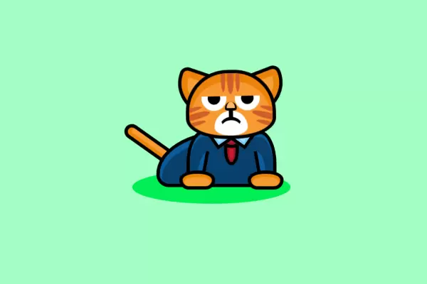
Рыжий строгий анимированый кот в свитере и с галстуком сидит покачивая головой, шевеля глазами и хвостом. Кот создан на основе html и css стилей. Кот станет отличным дополнением для украшения вашего тематического блога. Установка займет пару минут, приступим:
HTML
<div class="cat">

 <div class="head">

 <div class="face">

 <div class="stripes">
 <div class="top"></div>
 <div class="left"></div>
 <div class="right"></div>
 </div>

 <div class="eyes">
 <div class="left"></div>
 <div class="right"></div>
 </div>

 <div class="nose"></div>
 <div class="mouth"></div>

 </div>

 <div class="ears">
 <div class="left"></div>
 <div class="right"></div>
 </div>

 </div>

 <div class="suit">

 <div class="collar">
 <div class="top"></div>
 </div>

 <div class="arms">
 <div class="left"></div>
 <div class="right"></div>
 </div>

 <div class="paws">
 <div class="left"></div>
 <div class="right"></div>
 </div>

 <div class="body"></div>

 </div>

 <div class="tail"></div>
 <div class="shadow"></div>

</div>
CSS
body {
     background: #A4FFC4;
}
 .cat {
     position: absolute;
     top: 50%;
     left: 50%;
     transform: translate(-50%,-50%);
}
 .cat .head {
     position: relative;
     transform-origin: 50% 100%;
     animation: 15s nod infinite;
     z-index: 10;
}
 .cat .face {
     position: relative;
     width: 200px;
     height: 150px;
     background: #F89C31;
     border: 8px solid #000;
     border-top-left-radius: 100px 100px;
     border-top-right-radius: 100px 100px;
     border-bottom-left-radius: 100px 50px;
     border-bottom-right-radius: 100px 50px;
     box-shadow: inset 0 16px 0 4px #ee8408;
     overflow: hidden;
     z-index: 2;
}
 .cat .face .stripes .top {
     position: absolute;
     left: 50%;
     transform: translate(-50%,-20px);
     width: 15px;
     height: 70px;
     background: #D15B2A;
     border-radius: 100%;
}
 .cat .face .stripes .top:before, .cat .face .stripes .top:after {
     display: block;
     content: '';
     width: 10px;
     height: 60px;
     background: #D15B2A;
     border-radius: 100%;
}
 .cat .face .stripes .top:before {
     position: absolute;
     top: 5px;
     right: 20px;
}
 .cat .face .stripes .top:after {
     position: absolute;
     top: 5px;
     left: 20px;
}
 .cat .face .stripes .left {
     position: absolute;
     bottom: 40px;
     left: -20px;
     width: 70px;
     height: 15px;
     background: #D15B2A;
     border-radius: 100%;
     transform: rotate(-15deg);
}
 .cat .face .stripes .left:before, .cat .face .stripes .left:after {
     display: block;
     content: '';
     width: 60px;
     height: 10px;
     background: #D15B2A;
     border-radius: 100%;
}
 .cat .face .stripes .left:before {
     position: absolute;
     top: 20px;
     left: -5px;
}
 .cat .face .stripes .left:after {
     position: absolute;
     bottom: 20px;
     left: -5px;
}
 .cat .face .stripes .right {
     position: absolute;
     bottom: 40px;
     right: -20px;
     width: 70px;
     height: 15px;
     background: #D15B2A;
     border-radius: 100%;
     transform: rotate(15deg);
}
 .cat .face .stripes .right:before, .cat .face .stripes .right:after {
     display: block;
     content: '';
     width: 60px;
     height: 10px;
     background: #D15B2A;
     border-radius: 100%;
}
 .cat .face .stripes .right:before {
     position: absolute;
     top: 20px;
     right: -5px;
}
 .cat .face .stripes .right:after {
     position: absolute;
     bottom: 20px;
     right: -5px;
}
 .cat .face .eyes {
     position: absolute;
     top: 55px;
     width: 100%;
     height: 50px;
     border-radius: 100px;
     overflow: hidden;
}
 .cat .face .eyes:before {
     display: block;
     content: '';
     position: absolute;
     top: -20px;
     left: 50%;
     transform: translate(-50%,0);
     width: 150px;
     background: #F89C31;
     border-radius: 100%;
     z-index: 10;
     animation: 5s scowl infinite;
}
 .cat .face .eyes .left, .cat .face .eyes .right {
     position: absolute;
     top: -25px;
}
 .cat .face .eyes .left:before, .cat .face .eyes .right:before {
     display: block;
     content: '';
     width: 60px;
     height: 60px;
     background: #FFF;
     border-radius: 100%;
}
 .cat .face .eyes .left:after, .cat .face .eyes .right:after {
     display: block;
     content: '';
     position: absolute;
     top: 50%;
     left: 50%;
     transform: translate(-50%,-50%);
     width: 30px;
     height: 30px;
     background: #000;
     border-radius: 100%;
}
 .cat .face .eyes .left {
     left: 30px;
}
 .cat .face .eyes .right {
     right: 30px;
}
 .cat .face .nose {
     position: absolute;
     bottom: 60px;
     left: 50%;
     transform: translate(-50%,0);
     width: 20px;
     height: 15px;
     background: #FAB96A;
     border-left: 4px solid #000;
     border-right: 4px solid #000;
     border-bottom: 6px solid #000;
     border-top-left-radius: 30px 30px;
     border-top-right-radius: 30px 30px;
     border-bottom-left-radius: 20px 10px;
     border-bottom-right-radius: 20px 10px;
     z-index: 5;
}
 .cat .face .nose:after {
     display: block;
     content: '';
     position: absolute;
     top: 20px;
     left: 50%;
     transform: translate(-50%,0);
     width: 10px;
     height: 20px;
     background: #000;
}
 .cat .face .mouth {
     position: absolute;
     bottom: 0;
     left: 50%;
     transform: translate(-50%,0);
     width: 80px;
     height: 60px;
     background: #FFF;
     border-top-left-radius: 40px 40px;
     border-top-right-radius: 40px 40px;
     border-bottom-left-radius: 40px 20px;
     border-bottom-right-radius: 40px 20px;
}
 .cat .face .mouth:before {
     display: block;
     content: '';
     position: absolute;
     top: 15px;
     left: 50%;
     transform: translate(-50%,0);
     width: 50px;
     height: 50px;
     border-top: 8px solid #000;
     border-left: 4px solid transparent;
     border-right: 4px solid transparent;
     border-radius: 100%;
}
 .cat .ears .left {
     position: absolute;
     top: 0px;
     left: -25px;
     width: 80px;
     height: 80px;
     background: #f8a239;
     border: 8px solid #000;
     border-radius: 20px;
     border-bottom-left-radius: 80px;
     box-shadow: inset 0 0 0 15px #ee8408;
     transform: rotate(20deg);
     z-index: 0;
}
 .cat .ears .right {
     position: absolute;
     top: 0px;
     right: -25px;
     width: 80px;
     height: 80px;
     background: #f8a239;
     border: 8px solid #000;
     border-radius: 20px;
     border-bottom-right-radius: 80px;
     box-shadow: inset 0 0 0 15px #ee8408;
     transform: rotate(-20deg);
     z-index: 0;
}
 .cat .suit {
     position: relative;
     top: -20px;
     width: 200px;
     height: 120px;
     background: #08406d;
     border: 8px solid #000;
     border-top-left-radius: 40px 80px;
     border-top-right-radius: 40px 80px;
     box-shadow: inset 0 8px 0 0 #0C5C9C;
}
 .cat .suit .collar {
     position: absolute;
     left: 50%;
     transform: translate(-50%,0);
     width: 20px;
     height: 60px;
     background: #CB1B2E;
     border: 8px solid #000;
     border-bottom-left-radius: 100%;
     border-bottom-right-radius: 100%;
     box-shadow: inset 0 0px 0 5px #9e1524;
}
 .cat .suit .collar .top {
     position: absolute;
     top: -10px;
     left: 50%;
     transform: translate(-50%,0);
     width: 30px;
     height: 20px;
     background: #CB1B2E;
     border: 8px solid #000;
     border-radius: 100%;
     box-shadow: inset 0 0px 0 5px #9e1524;
     z-index: 1;
}
 .cat .suit .collar:before {
     display: block;
     content: '';
     position: absolute;
     top: -25px;
     left: -40px;
     width: 30px;
     height: 30px;
     background: #AAE0FB;
     border: 8px solid #000;
     box-shadow: inset 0 0px 0 5px #79cef9;
     transform: rotate(55deg);
     z-index: 2;
}
 .cat .suit .collar:after {
     display: block;
     content: '';
     position: absolute;
     top: -25px;
     right: -40px;
     width: 30px;
     height: 30px;
     background: #AAE0FB;
     border: 8px solid #000;
     box-shadow: inset 0 0px 0 5px #79cef9;
     transform: rotate(-55deg);
     z-index: 2;
}
 .cat .suit .arms .left {
     position: absolute;
     bottom: 0;
     left: 20px;
     width: 12px;
     height: 80px;
     background: #0C5C9C;
     border-right: 8px solid #000;
     border-top-left-radius: 80%;
     transform: rotate(10deg);
}
 .cat .suit .arms .right {
     position: absolute;
     bottom: 0;
     right: 20px;
     width: 12px;
     height: 80px;
     background: #0C5C9C;
     border-left: 8px solid #000;
     border-top-right-radius: 80% 40%;
     transform: rotate(-10deg);
}
 .cat .suit .paws .left, .cat .suit .paws .right {
     width: 70px;
     height: 30px;
     background: #F89C31;
     border: 8px solid #000;
     border-top-left-radius: 100%;
     border-top-right-radius: 100%;
     border-bottom-left-radius: 50px;
     border-bottom-right-radius: 50px;
     box-shadow: inset 0 4px 0 4px #ee8408;
}
 .cat .suit .paws .left {
     position: absolute;
     bottom: -14px;
     left: -25px;
}
 .cat .suit .paws .right {
     position: absolute;
     bottom: -14px;
     right: -25px;
}
 .cat .suit .body {
     position: absolute;
     left: -80px;
     bottom: -8px;
     width: 200px;
     height: 120px;
     background: #08406d;
     border: 8px solid #000;
     border-top-left-radius: 100%;
     border-top-right-radius: 40px;
     border-bottom-left-radius: 40px;
     box-shadow: inset 0 10px 0 5px #0C5C9C;
     z-index: -1;
}
 .cat .tail {
     position: absolute;
     left: -60px;
     bottom: 100px;
     width: 20px;
     height: 120px;
     background: #F89C31;
     border: 8px solid #000;
     border-top-left-radius: 20px;
     border-top-right-radius: 20px;
     box-shadow: inset 4px 4px 0 4px #ee8408;
     transform: rotate(-45deg);
     transform-origin: 100% 100%;
     z-index: -2;
     animation: 5s wag infinite;
}
 .cat .shadow {
     position: absolute;
     bottom: -20px;
     left: -130px;
     width: 380px;
     height: 80px;
     background: #00f155;
     border-radius: 100%;
     z-index: -3;
}
 @keyframes wag {
     0% {
         transform: rotate(-45deg);
    }
     50% {
         transform: rotate(-55deg);
    }
     100% {
         transform: rotate(-45deg);
    }
}
 @keyframes scowl {
     0% {
         height: 30px;
    }
     50% {
         height: 20px;
    }
     100% {
         height: 30px;
    }
}
 @keyframes nod {
     0% {
         transform: rotate(0);
    }
     30% {
         transform: rotate(5deg);
    }
     70% {
         transform: rotate(-5deg);
    }
     100% {
         transform: rotate(0);
    }
}


Комментарии
all-
цитироватьТестируйте на 18 версии у кого есть возможность) если что подправим

 честно нет времени вообще. Ну вы еще ждёте?)) Я обновил, пробуйте
-
цитироватьТимофей, Мой взгляд, тогда у людей была Родина, было за что сражаться... и не важно какой был отдан приказ.... взять любой ценой... у меня два деда и две бабки были .. прошли всё это... они сделали это ради нас ... за нашу Родину!!! А наша Родина это наша Родина!


admin
27 мая 2025 21:56