


Кот в ящике Шрёдингера на HTML и CSS
25-августа-2023, 21:18 23 0
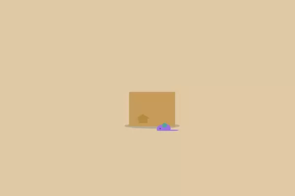
Интересное решение для украшения сайта или блога, кот в ящике Шрёдингера . Суть анимации заключается в том , что пользователь кликает по коробочке и из неё появляется котик. При повторном клике , кот соответственно прячется. Как использовать данную анимацию решать вам, для тех кому интересно то 8 августа международный день кошек . Ну а мы переходим к установке.
HTML
<input type="checkbox" id="check" class="checkboxer">
<label class="container" for="check">
    <div class="box-wiggle">

        <div class="box">
            <div class="box-flap box-flap-left"></div>
            <div class="box-flap box-flap-right"></div>
            <div class="box-arrow"></div>
        </div>
        <div class="jasp">
            <div class="jasp-ear jasp-ear-left"></div>
            <div class="jasp-ear jasp-ear-right"></div>
            <div class="jasp-head">
                <div class="jasp-head-lower"></div>
            </div>
            <div class="jasp-face">
                <div class="jasp-eye jasp-eye-left"></div>
                <div class="jasp-eye jasp-eye-right"></div>
                <div class="jasp-snoot"></div>
                <div class="jasp-whisker jasp-whisker-left"></div>
                <div class="jasp-whisker jasp-whisker-right"></div>
            </div>
            <div class="jasp-body"></div>

    </div>
    </div>
    <div class="mouse">
        <div class="mouse-ear"></div>
    </div>
</label>
CSS
* {
  box-sizing: border-box;
}
body {
  display: flex;
  justify-content: center;
  align-items: center;
  height: 100vh;
  background-color: rgb(224,201,165);
}
.container {
  position: relative;
  margin-top: 6rem;
  cursor: pointer;
}
.container::before {
  content: '';
  position: absolute;
  z-index: -1;
  bottom: -0.5rem;
  left: 50%;
  width: 120%;
  height: 17%;
  border-radius: 50%;
  background-color: rgba(68, 68, 68, 0.25);
  transform: translateX(-50%);
}
.box {
  position: relative;
  z-index: 20;
  height: 7rem;
  width: 10rem;
  background-color: rgb(197,156,90);
}
.box-wiggle {
  transform-origin: bottom center;
}
.box-flap {
  position: absolute;
  bottom: 100%;
  height: 0.5rem;
  width: 50%;
  background-color: rgb(197,156,90);
  transition: 0.45s 0.6s ease-in-out;
}
.box-flap-left {
  left: 0;
  transform-origin: bottom left;
}
.box-flap-right {
  right: 0;
  transform-origin: bottom right;
}
.box-arrow {
  position: absolute;
  bottom: 10%;
  left: 20%;
  height: 1rem;
  width: 2rem;
  background-color: rgb(182,137,64);
}
.box-arrow::before {
  content: '';
  position: absolute;
  bottom: 100%;
  left: 50%;
  width: 0;
  height: 0;
  border-left: 1.5rem solid transparent;
  border-right: 1.5rem solid transparent;
  border-bottom: 1rem solid #b68940;
  transform: translateX(-50%);
}
.jasp {
  position: absolute;
  top: 0;
  right: 0.5rem;
  transition: 0.4s 0.1s ease-out;
}
.jasp-head {
  position: relative;
  z-index: 5;
  top: 0;
  height: 6rem;
  width: 7rem;
  background-color: rgb(98,90,106);
  overflow: hidden;
  border-top-left-radius: 50% 3.5rem;
  border-top-right-radius: 50% 3.5rem;
  border-bottom-left-radius: 50% 2rem;
  border-bottom-right-radius: 50% 2rem;
}
.jasp-head-lower {
  position: absolute;
  bottom: 0;
  height: 55%;
  width: 100%;
  background-color: rgb(255,255,255);
}
.jasp-head-lower::before, .jasp-head-lower::after {
  content: '';
  position: absolute;
  top: -100%;
  height: 150%;
  width: 100%;
  background-color: #625a6a;
  border-bottom-left-radius: 40% 1.75rem;
  border-bottom-right-radius: 40% 1.75rem;
}
.jasp-head-lower::before {
  left: -0.25rem;
  transform: translateX(-50%);
}
.jasp-head-lower::after {
  right: -0.25rem;
  transform: translateX(50%);
}
.jasp-ear {
  position: absolute;
  z-index: 1;
  bottom: calc(100% - 4em);
  height: 4em;
  width: 2.5em;
  background-color: rgb(98,90,106);
  transform-origin: bottom center;
}
.jasp-ear::after {
  content: '';
  position: absolute;
  bottom: 0;
  height: 70%;
  width: 60%;
  background-color: rgb(238,139,164);
}
.jasp-ear-left {
  left: 0;
  border-top-left-radius: 80% 0.5em;
  border-top-right-radius: 80% 0.5em;
  border-bottom-left-radius: 0.5em 80%;
  transform: skewY(20deg);
}
.jasp-ear-left::after {
  left: 15%;
  border-top-left-radius: 0.125em;
}
.jasp-ear-right {
  right: 0;
  border-top-left-radius: 80% 0.5em;
  border-top-right-radius: 80% 0.5em;
  border-bottom-right-radius: 0.5em 80%;
  transform: skewY(-20deg);
}
.jasp-ear-right::after {
  right: 15%;
  border-top-right-radius: 0.125em;
}
.jasp-face {
  position: absolute;
  z-index: 10;
  top: 0;
  left: 0;
  height: 100%;
  width: 100%;
}
.jasp-eye {
  position: absolute;
  top: 3rem;
  height: 0.75rem;
  width: 0.875rem;
  border-radius: 50%;
  background-color: rgb(172,222,98);
  transform-origin: center 70%;
  animation-name: blinky;
  animation-duration: 5s;
  animation-iteration-count: infinite;
}
.jasp-eye-left {
  left: 1rem;
}
.jasp-eye-right {
  right: 1rem;
}
.jasp-snoot {
  position: absolute;
  top: 3.75rem;
  left: 50%;
  height: 0.5rem;
  width: 1rem;
  border-radius: 0.5rem;
  background-color: rgb(238,139,164);
  transform: translateX(-50%);
}
.jasp-snoot::before {
  content: '';
  position: absolute;
  top: 0;
  left: 50%;
  width: 0.5rem;
  height: 0.75rem;
  border-radius: 0.5rem;
  background-color: rgb(238,139,164);
  transform: translate(-50%);
}
.jasp-whisker {
  position: absolute;
  top: 4.5rem;
  width: 2.5rem;
}
.jasp-whisker::before, .jasp-whisker::after {
  content: '';
  position: absolute;
  height: 0.125rem;
  width: 100%;
  background-color: #fff;
  box-shadow: 0 0.0625rem 0 rgba(98, 90, 106, 0.4);
}
.jasp-whisker::after {
  top: 0.25rem;
}
.jasp-whisker-left {
  right: calc(100% - 2rem);
}
.jasp-whisker-left::before, .jasp-whisker-left::after {
  transform-origin: center right;
  border-top-left-radius: 50%;
  border-bottom-left-radius: 50%;
}
.jasp-whisker-left::before {
  transform: rotate(-5deg);
}
.jasp-whisker-left::after {
  transform: rotate(-12deg);
}
.jasp-whisker-right {
  left: calc(100% - 2rem);
}
.jasp-whisker-right::before, .jasp-whisker-right::after {
  transform-origin: center left;
  border-top-right-radius: 50%;
  border-bottom-right-radius: 50%;
}
.jasp-whisker-right::before {
  transform: rotate(5deg);
}
.jasp-whisker-right::after {
  transform: rotate(12deg);
}
.jasp-body {
  position: absolute;
  z-index: 4;
  top: calc(100% - 2rem);
  right: -0.25rem;
  height: 3rem;
  width: 9.5rem;
  border-top-left-radius: 50% 3rem;
  border-top-right-radius: 20% 3rem;
  background-color: #625a6a;
}
.jasp-body::before {
  content: '';
  position: absolute;
  right: 2.75rem;
  top: 0;
  height: 100%;
  width: 2rem;
  background-color: #fff;
}
.mouse {
  position: absolute;
  z-index: 30;
  bottom: -1rem;
  right: 1rem;
  height: 1.5rem;
  width: 3rem;
  border-top-left-radius: 70% 1rem;
  border-top-right-radius: 30% 1rem;
  border-bottom-left-radius: 0.325rem;
  border-bottom-right-radius: 0.325rem;
  background-color: #9c73e6;
}
.mouse::before, .mouse::after {
  content: '';
  position: absolute;
}
.mouse::before {
  bottom: 0.375rem;
  left: 0.625rem;
  height: 0.25rem;
  width: 0.25rem;
  border-radius: 50%;
  background-color: #444;
}
.mouse::after {
  left: calc(100% - 0.25rem);
  bottom: 0;
  height: 0.25rem;
  width: 2rem;
  background-color: #9c73e6;
  border-top-right-radius: 50%;
  border-bottom-right-radius: 50%;
}
.mouse-ear {
  position: absolute;
  bottom: calc(100% - 0.75rem);
  left: 1.25rem;
  height: 1rem;
  width: 1rem;
  border-radius: 50%;
  border-bottom-left-radius: 0.125rem;
  background-color: #52a494;
  transform: rotate(10deg);
}
.checkboxer {
  position: absolute;
  opacity: 0;
}
.checkboxer:checked + .container .box-flap {
  transition: 0.45s ease-in-out;
}
.checkboxer:checked + .container .box-flap-left {
  transform: rotate(-250deg);
}
.checkboxer:checked + .container .box-flap-right {
  transform: rotate(250deg);
}
.checkboxer:checked + .container .jasp {
  transform: translateY(-5.75rem);
}
.checkboxer:not(:checked):not(:focus) + .container:hover .box-wiggle {
  animation-name: wiggle;
  animation-duration: 3s;
}
@keyframes blinky {
  0%, 9%, 11%, 19%, 21%, 69%, 71%, 100% {
    transform: scaleY(1);
  }
  10%, 20%, 70% {
    transform: scaleY(0.1);
  }
}
@keyframes wiggle {
  0%, 15%, 43%, 64% {
    transform: rotate(0deg) translateY(0);
  }
  5% {
    transform: rotate(5deg) scaleX(1.02) translateY(-0.25rem);
  }
  10% {
    transform: rotate(-5deg) scaleX(1.02) translateY(0);
  }
  50% {
    transform: rotate(-3deg) scaleX(1.01) translateY(-0.125rem);
  }
  57% {
    transform: rotate(3deg) scaleX(1.01) translateY(0);
  }
}

Комментарии
all-
цитироватьТестируйте на 18 версии у кого есть возможность) если что подправим

 честно нет времени вообще. Ну вы еще ждёте?)) Я обновил, пробуйте
-
цитироватьТимофей, Мой взгляд, тогда у людей была Родина, было за что сражаться... и не важно какой был отдан приказ.... взять любой ценой... у меня два деда и две бабки были .. прошли всё это... они сделали это ради нас ... за нашу Родину!!! А наша Родина это наша Родина!


admin
27 мая 2025 21:56