


Новогоднее украшение для сайта Кошмар перед Рождеством
30-октября-2025, 21:22 415 0
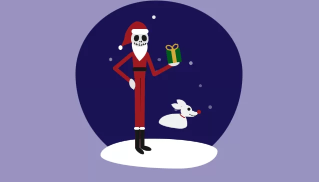
Здравствуйте дорогие пользователи. Близятся зимние праздники. Скоро Новый год, Рождество. Пора сказки, подарков, деда Мороза или Джека? Все наверное знают классный мультфильм? Или нет? Старый мультфильм выпуска 1993 года - Кошмар перед Рождеством. Как по мне то классный мультик. А что если сделать красивую открытку или блок с Джеком? Данный сниппет как всегда был найден на просторах буржу-нета. Мне он очень понравился. Анимация, мелодия. Возможность расширить функционал. И так приступим.
HTML
<audio id="player" src="/uploads/files/2022-11/1667405672_the-nightmare-before-christmas.mp3"></audio>
<div id="player-container">
  <span id="play-button" onclick="togglePlay()">
    <svg width="11px" height="14px" viewBox="0 0 11 14" version="1.1" xmlns="http://www.w3.org/2000/svg" xmlns:xlink="http://www.w3.org/1999/xlink">
      <title>play_arrow</title>
      <desc>Created with Sketch.</desc>
      <g id="Icons" stroke="none" stroke-width="1" fill="none" fill-rule="evenodd">
        <g id="Rounded" transform="translate(-753.000000, -955.000000)">
          <g id="AV" transform="translate(100.000000, 852.000000)">
            <g id="-Round-/-AV-/-play_arrow" transform="translate(646.000000, 98.000000)">
              <g>
                <rect id="Rectangle-Copy-50" x="0" y="0" width="24" height="24"></rect>
                <path d="M7,6.82 L7,17.18 C7,17.97 7.87,18.45 8.54,18.02 L16.68,12.84 C17.3,12.45 17.3,11.55 16.68,11.15 L8.54,5.98 C7.87,5.55 7,6.03 7,6.82 Z" id="icon-color" fill="#1D1D1D"></path>
              </g>
            </g>
          </g>
        </g>
      </g>
    </svg></span>
  <span id="mute-button" onclick="toggleMute()">
    <svg width="18px" height="18px" viewBox="0 0 18 18" version="1.1" xmlns="http://www.w3.org/2000/svg" xmlns:xlink="http://www.w3.org/1999/xlink">
      <title>volume_up</title>
      <desc>Created with Sketch.</desc>
      <g id="Icons" stroke="none" stroke-width="1" fill="none" fill-rule="evenodd">
        <g id="Rounded" transform="translate(-817.000000, -997.000000)">
          <g id="AV" transform="translate(100.000000, 852.000000)">
            <g id="-Round-/-AV-/-volume_up" transform="translate(714.000000, 142.000000)">
              <g transform="translate(0.000000, 0.000000)">
                <rect id="Rectangle-Copy-86" x="0" y="0" width="24" height="24"></rect>
                <path d="M3,10 L3,14 C3,14.55 3.45,15 4,15 L7,15 L10.29,18.29 C10.92,18.92 12,18.47 12,17.58 L12,6.41 C12,5.52 10.92,5.07 10.29,5.7 L7,9 L4,9 C3.45,9 3,9.45 3,10 Z M16.5,12 C16.5,10.23 15.48,8.71 14,7.97 L14,16.02 C15.48,15.29 16.5,13.77 16.5,12 Z M14,4.45 L14,4.65 C14,5.03 14.25,5.36 14.6,5.5 C17.18,6.53 19,9.06 19,12 C19,14.94 17.18,17.47 14.6,18.5 C14.24,18.64 14,18.97 14,19.35 L14,19.55 C14,20.18 14.63,20.62 15.21,20.4 C18.6,19.11 21,15.84 21,12 C21,8.16 18.6,4.89 15.21,3.6 C14.63,3.37 14,3.82 14,4.45 Z" id="icon-color" fill="#1D1D1D"></path>
              </g>
            </g>
          </g>
        </g>
      </g>
    </svg></span>
</div>

<div class="container">
  <div class="snowflake snow1"></div>
  <div class="snowflake snow2"></div>
  <div class="snowflake snow3"></div>
  <div class="snowflake snow4"></div>
  <div class="snowflake snow5"></div>
  <div class="snowflake snow6"></div>
    <div class="snowflake snow7"></div>
  <div class="snowflake snow8"></div>
  <div class="jack">
    <div class="head">
      <div class="head-copy">
        <div class="left-eye"></div>
        <div class="right-eye"></div>
        <div class="left-nostril"></div>
        <div class="right-nostril"></div>
        <div class="smile">
          <div class="stitch s1"></div>
          <div class="stitch s2"></div>
          <div class="stitch s3"></div>
          <div class="stitch s4"></div>
          <div class="stitch s5"></div>
          <div class="stitch s6"></div>
        </div>

      </div>
      <div class="hat-front">
        <div class="hat-lining"></div>
      </div>
      <div class="hat-tail"></div>
      <div class="hat-tip">
      </div>
      <div class="hat-ball"></div>
      <div class="beard"></div>
    </div>
    <div class="torso">
    </div>
    <div class="belt"></div>
    <div class="upper-arm lau"></div>
    <div class="lower-arm lal"></div>
    <div class="upper-arm rau"></div>
    <div class="arm-animate">
      <div class="lower-arm ral"></div>
      <div class="hand hand-right"></div>
      <div class="present">
        <div class="ribbon"></div>
        <div class="bow bow1"></div>
        <div class="bow bow2"></div>
      </div>
    </div>
    <div class="hand hand-left"></div>
    <div class="right-leg">
      <div class="boot"></div>
    </div>
    <div class="left-leg">
      <div class="boot"></div>
    </div>
    <div class="boot-bottom br"></div>
    <div class="boot-bottom bl"></div>
    <div class="boot-lining blr"></div>
    <div class="boot-lining bll"></div>
  </div>
  <div class="zero">
    <div class="head-zero">
      <div class="snout"></div>
      <div class="snout-cover"></div>
      <div class="zero-ear zel"></div>
      <div class="zero-ear zer"></div>
      <div class="zero-eye"></div>
      <div class="zero-nose"></div>
      <div class="zero-smile"></div>
      <div class="zero-collar"></div>
    </div>
    <div class="zero-body"></div>
  </div>
  <div class="ground"></div>
</div>
CSS
$jack: #e3e3e3;
$red: #A01A21;
$black: #171717;
$green: #005c1d;
$blue: #1a1354;
$zero: #f0f0f0;
$present: #d6aa3a;
$lighter-green: #067a5b;


* {
  padding: 0;
  margin: 0;
}

body {
  background: #9893bf;
  position: relative;
  height: 100%;
  width: 100%;
}

.container {
  position: relative;
  width: 500px;
  height: 500px;
  background: $blue;
  border-radius: 48% 52% 49% 51% / 44% 44% 56% 56% ;
  margin: auto;
  margin-top: 12vh;
  margin-bottom: 2rem;
}

.ground {
  position: absolute;
  width: 70%;
  height: 18%;
  border-radius:43% 57% 33% 67% / 55% 42% 58% 45% ;
  background: white;
  z-index: 1;
  bottom: -1%;
  left: 15%;
}

.present {
  position: absolute;
  width: 9%;
  height: 9%;
  border-radius: 3px;
  background: $green;
  top: 25.5%;
  left: 40%;
  z-index: 3;
}

.ribbon {
  position: absolute;
  width: 28%;
  height: 100%;
  background: $present;
  left: 36%;
}

.bow {
  position: absolute;
  width: 30%;
  height: 30%;
  background: transparent;
  border: 4px solid $present;
  border-radius: 30% 70% 0% 100% / 30% 100% 0% 70%;
}

.bow1 {
  top: -35%;
  left: 5%;
  transform: rotate(-15deg);
}

.bow2{
  top: -35%;
  left: 45%;
  transform: rotate(10deg) scaleX(-1);
}

//MUSIC BUTTONS

svg {
  height: 22px;
  width: 22px;
  padding-top: 12px;
  padding-left: 3px;
}

svg:hover {
  cursor: pointer;
}

#pause {
  height: 19px;
  width: 19px;
  padding-bottom: 2px;
}


#icon-color {
  fill: $blue;
}

#player-container {
  position: absolute;
  width: 100px;
  height: 50px;
  background: white;
  border-radius: 49% 51% 71% 29% / 54% 42% 58% 46% ;
  right: 40px;
  top: -40px;
  text-align: center;
  z-index: 4;
}


//JACK

.jack {
  position: absolute;
  width: 95%;
  height: 95%;
  left: 18%;
  top: 7%;
  z-index: 3;
}

.head {
  position: absolute;
  width: 11%;
  height: 11%;
  background: $jack;
  border-radius: 50% 50% 50% 50% / 55% 55% 45% 45%;
  top: 11%;
  left: 16%;
}

.head-copy {
  position: absolute;
  width: 100%;
  height: 100%;
  border-radius: 50% 50% 50% 50% / 55% 55% 45% 45%;
  background: $jack;
  z-index: 2;
}

.left-eye {
  position: absolute;
  width: 30%;
  height: 36%;
  border-radius: 60% 40% 53% 47% / 50% 50% 50% 50%;
  background: $black;
  top: 32%;
  left: 16%;
  transform: rotate(10deg);
}

.right-eye {
  position: absolute;
  width: 30%;
  height: 36%;
  border-radius: 60% 40% 53% 47% / 50% 50% 50% 50%;
  background: $black;
  top: 32%;
  left: 60%;
  transform: rotate(-10deg) scaleX(-1);
}

.left-nostril {
  position: absolute;
  width: 5%;
  height: 8%;
  border-radius: 0% 100% 25% 75% / 0% 75% 25% 100%;
  background: $black;
  top: 65%;
  left: 48%;
  transform: scaleX(-1);
}

.right-nostril {
  position: absolute;
  width: 5%;
  height: 8%;
  border-radius: 0% 100% 25% 75% / 0% 75% 25% 100%;
  background: $black;
  top: 65.5%;
  left: 58%;
  transform: scaleX(1);
}

.smile {
  position: absolute;
  width: 90%;
  height: 60%;
  border-radius: 50%;
  border: 1px solid;
  background: transparent;
  border-color: transparent transparent $black transparent;
  top: 26%;
  left: 5%;
}

.stitch {
  position: absolute;
  width: 1px;
  height: 20%;
  background: $black;
}

.s1 {
  top: 76%;
  left: 15%;
}

.s2 {
  top: 83%;
  left: 28%;
}

.s3 {
  top: 88%;
  left: 41%;
}

.s4 {
  top: 90%;
  left: 54%;
}

.s5 {
  top: 87%;
  left: 67%;
}

.s6 {
  top: 80%;
  left: 80%;
}

.hat-front {
  position: absolute;
  width: 87%;
  height: 65%;
  background: $red;
  border-radius: 30% 70% 50% 50% / 100% 100% 0% 0%;
  top: -45%;
  left: 7%;
  z-index: 2;
}

.hat-tail {
  position: absolute;
  width: 70%;
  height: 140%;
  border-radius: 50%;
  background: $red;
  z-index: -1;
  left: -25%;
  top: -51%;
  transform: rotate(30deg);
  z-index: 1;
}

.hat-tip {
  position: absolute;
  width: 40%;
  height: 50%;
  background: $red;
  clip-path: polygon(50% 100%, 0 0, 100% 0);
  top: 58%;
  left: -60%;
  transform: rotate(45deg);
  z-index: 1;
}

.hat-ball {
  position: absolute;
  width: 25%;
  height: 25%;
  border-radius: 50%;
  background: white;
  left: -73%;
  top: 93%;
  z-index: 1;
}

.hat-lining {
  position: absolute;
  width: 115%;
  height: 45%;
  border-radius: 20px;
  background: white;
  top: 63%;
  left: -6%;
}

.beard {
  position: absolute;
  width: 100%;
  height: 115%;
  background: white;
  border-radius: 100% 0% 55% 45% / 55% 0% 100% 45%;
  transform: rotate(140deg);
  z-index: 1;
  top: 50%;
  left: 0%;
}

.torso {
  position: absolute;
  width: 10%;
  height: 17%;
  background: $red;
  clip-path: polygon(0 0, 100% 0, 83% 100%, 17% 100%);
  top: 25%;
  left: 16.5%;
}

.belt {
  position: absolute;
  width: 9%;
  height: 2.5%;
  background: $black;
  border-radius: 5px;
  top: 35%;
  left: 17%;
}

.left-leg {
  position: absolute;
  width: 3.3%;
  height: 45%;
  background: $red;
  top: 41.5%;
  left: 18.3%;
  border-right: 1px solid black;
  border-radius: 0 0 10px 10px;
  clip-path: polygon(0 0, 100% 0, 89% 100%, 11% 100%);
}

.right-leg {
  position: absolute;
  width: 3.3%;
  height: 45%;
  background: $red;
  top: 41.5%;
  left: 21.5%;
  border-radius: 0 0 10px 10px;
  clip-path: polygon(0 0, 100% 0, 89% 100%, 11% 100%);
}

.upper-arm {
  position: absolute;
  width: 2.5%;
  height: 16%;
  border-radius: 10px;
  background: $red;
}

.lower-arm {
  position: absolute;
  width: 2.5%;
  height: 15%;
  border-radius: 10px;
  background: $red;
}

.lau {
  top: 23%;
  left: 10%;
  transform: rotate(50deg);
}

.lal {
  top: 32%;
  left: 9.5%;
  transform: rotate(-50deg);
}

.rau {
  top: 25%;
  left: 27%;
  transform: rotate(-20deg);
}

.ral {
  top: 30%;
  left: 35.4%;
  transform: rotate(-110deg);
}

.hand {
  position: absolute;
  background: $jack;
  width: 5.5%;
  height: 5.5%;
  border-radius: 15% 85% 0% 100% / 15% 100% 0% 85%;
}

.hand-right {
  left: 41%;
  top: 32%;
  transform: rotate(-40deg);
}

.hand-left {
  left: 14%;
  top: 43%;
  transform: rotate(30deg);
  z-index: 3;
}

.arm-animate {
  position: absolute;
  width: 100%;
  height: 100%;
  animation: arm-lift 3s linear 200ms infinite;
}

.boot {
  position: absolute;
  background: $black;
  width: 100%;
  height: 30%;
  bottom: 0%;
  z-index: 3;
  border-radius: 0 0 10px 10px;
}

.boot-bottom {
  position: absolute;
  width: 7%;
  height: 3%;
  border-radius: 50%;
  background: $black;
}

.br {
  top: 86%;
  left: 18%;
  transform: rotate(40deg);
}

.bl {
  top: 85%;
  left: 22%;
  transform: rotate(15deg);
}

.boot-lining {
  position: absolute;
  width: 3.5%;
  height: 1.5%;
  background: white;
  border-radius: 10px;
}

.blr {
  top: 73%;
  left: 18%;
}

.bll {
  top: 73%;
  left: 21.5%;
}

//ZERO

.zero {
  position: absolute;
  width: 100%;
  height: 100%;
  animation: float 5s linear .1s infinite;
  z-index: 3;
}

.head-zero {
  position: absolute;
  width: 7%;
  height: 7%;
  background: $zero;
  border-radius: 50%;
  left: 63%;
  top: 62%;
  transform: scaleX(-1) rotate(10deg);
  z-index: 4;
}

.snout {
  position: absolute;
  width: 145%;
  height: 50%;
  border-radius: 50%;
  border-bottom: 1.1rem solid $zero;
  background: transparent;
  left: -50%;
  top: 10%;
  transform: rotate(-15deg);
}

.snout-cover {
  position: absolute;
  width: 65%;
  height: 20%;
  border-radius: 50%;
  border-bottom: 0.5rem solid $zero;
  background: transparent;
  left: -48%;
  top: 42%;
  transform: rotate(-30deg);
}

.zero-ear {
  position: absolute;
  width: 75%;
  height: 75%;
  background: $zero;
  border-radius: 100% 0% 100% 0% / 100% 0% 100% 0%;
}

.zel {
  top: -40%;
  left: 85%;
  transform: rotate(15deg);
}

.zer {
  top: -60%;
  left: 40%;
}

.zero-body {
  position: absolute;
  width: 17%;
  height: 9%;
  background: $zero;
  border-radius: 76% 24% 27% 73% / 69% 74% 26% 31%;
  top: 67%;
  left: 50%;
  z-index: 3;
  transform: rotate(5deg);
}

.zero-nose {
  position: absolute;
  width: 35%;
  height: 35%;
  border-radius: 50%;
  background: $red;
  right: 140%;
  top: 60%;
}

.zero-eye {
  position: absolute;
  width: 26%;
  height: 26%;
  border-radius: 50%;
  background: $black;
  right: 61%;
  top: 24%;
}

.zero-smile {
  position: absolute;
  width: 80%;
  height: 40%;
  border-radius: 50%;
  background: transparent;
  border: 2px solid;
  border-color: transparent transparent $black transparent;
  top: 51%;
  right: 60%;
  transform: rotate(-20deg);
}

.zero-collar {
  position: absolute;
  background: transparent;
  width: 50%;
  height: 10%;
  border-radius: 50%;
  border: 4px solid;
  border-color: transparent transparent $red transparent;
  transform: rotate(-45deg);
  top: 64%;
  left: 47%;
}

.snowflake {
  position: absolute;
  width: 2%;
  height: 2%;
  border-radius: 50%;
  background: white;
}

.snow1 {
  right: 10%;
  top: 20%;
  animation: snowfall 3s linear 50ms infinite;
}

.snow2 {
  right: 20%;
  top: 12%;
  animation: snowfall 2.5s linear 400ms infinite;
}

.snow3 {
  right: 35%;
  top: 5%;
    animation: snowfall 3s linear 100ms infinite;
}

.snow4 {
  right: 50%;
  top: 4%;
    animation: snowfall 2.8s linear 1ms infinite;
}

.snow5 {
  right: 67%;
  top: 7%;
  animation: snowfall 3s linear 500ms infinite;
}

.snow6 {
  right: 25%;
  top: 30%;
  animation: snowfall 3s linear 100ms infinite;
}

.snow7 {
  right: 40%;
  top: 20%;
    animation: snowfall 3s linear 600ms infinite;
}

.snow8 {
  right: 5%;
  top: 30%;
    animation: snowfall 3s linear 180ms infinite;
}


//ANIMATIONS


@keyframes snowfall {
  0% {
    filter: opacity(100%);
    transform: translate(0,0);
  }
   100% {
    filter: opacity(0%);
     transform: translate(-1000%, 2500%);
  }
}

@keyframes float {
  0% {
    transform: translate(0%, 0%);
  }
  25% {
    transform: translate(-1%, 1%);
    color: pink;
  }
  50% {
    transform: translate(-1%, 0%);
  }
    75% {
    transform: translate(0%, 1%);
  }
    100% {
    transform: translate(0%, 0%);
  }

}

@keyframes arm-lift {
  0% {
    transform: rotate(0);
  }

  50% {
    transform: rotate(-12deg) translateY(-4%) translateX(3%);
  }

  100% {
    transform: rotate(0);
  }
}
JS
const mute = `<?xml version="1.0" encoding="UTF-8"?>
<svg width="18px" height="18px" viewBox="0 0 18 18" version="1.1" xmlns="http://www.w3.org/2000/svg" xmlns:xlink="http://www.w3.org/1999/xlink">
    <title>volume_up</title>
    <desc>Created with Sketch.</desc>
    <g id="Icons" stroke="none" stroke-width="1" fill="none" fill-rule="evenodd">
        <g id="Rounded" transform="translate(-817.000000, -997.000000)">
            <g id="AV" transform="translate(100.000000, 852.000000)">
                <g id="-Round-/-AV-/-volume_up" transform="translate(714.000000, 142.000000)">
                    <g transform="translate(0.000000, 0.000000)">
                        <rect id="Rectangle-Copy-86" x="0" y="0" width="24" height="24"></rect>
                        <path d="M3,10 L3,14 C3,14.55 3.45,15 4,15 L7,15 L10.29,18.29 C10.92,18.92 12,18.47 12,17.58 L12,6.41 C12,5.52 10.92,5.07 10.29,5.7 L7,9 L4,9 C3.45,9 3,9.45 3,10 Z M16.5,12 C16.5,10.23 15.48,8.71 14,7.97 L14,16.02 C15.48,15.29 16.5,13.77 16.5,12 Z M14,4.45 L14,4.65 C14,5.03 14.25,5.36 14.6,5.5 C17.18,6.53 19,9.06 19,12 C19,14.94 17.18,17.47 14.6,18.5 C14.24,18.64 14,18.97 14,19.35 L14,19.55 C14,20.18 14.63,20.62 15.21,20.4 C18.6,19.11 21,15.84 21,12 C21,8.16 18.6,4.89 15.21,3.6 C14.63,3.37 14,3.82 14,4.45 Z" id="icon-color" fill="#1D1D1D"></path>
                    </g>
                </g>
            </g>
        </g>
    </g>
</svg>`;

const unmute = `<?xml version="1.0" encoding="UTF-8"?>
<svg width="9px" height="14px" viewBox="0 0 9 14" version="1.1" xmlns="http://www.w3.org/2000/svg" xmlns:xlink="http://www.w3.org/1999/xlink">
    <!-- Generator: Sketch 52.5 (67469) - http://www.bohemiancoding.com/sketch -->
    <title>volume_mute</title>
    <desc>Created with Sketch.</desc>
    <g id="Icons" stroke="none" stroke-width="1" fill="none" fill-rule="evenodd">
        <g id="Rounded" transform="translate(-754.000000, -999.000000)">
            <g id="AV" transform="translate(100.000000, 852.000000)">
                <g id="-Round-/-AV-/-volume_mute" transform="translate(646.000000, 142.000000)">
                    <g>
                        <rect id="Rectangle-Copy-84" x="0" y="0" width="24" height="24"></rect>
                        <path d="M8,10 L8,14 C8,14.55 8.45,15 9,15 L12,15 L15.29,18.29 C15.92,18.92 17,18.47 17,17.58 L17,6.41 C17,5.52 15.92,5.07 15.29,5.7 L12,9 L9,9 C8.45,9 8,9.45 8,10 Z" id="icon-color" fill="#1D1D1D"></path>
                    </g>
                </g>
            </g>
        </g>
    </g>
</svg>`;

const pauseSVG = `<?xml version="1.0" encoding="UTF-8" standalone="no"?>
<svg id="pause" width="15px" height="15px" viewBox="0 0 6 8" version="1.1" xmlns="http://www.w3.org/2000/svg" xmlns:xlink="http://www.w3.org/1999/xlink">
    <title>pause [#1006]</title>
    <desc>Created with Sketch.</desc>
    <defs></defs>
    <g id="Page-1" stroke="none" stroke-width="1" fill="none" fill-rule="evenodd">
        <g id="icon-color" transform="translate(-227.000000, -3765.000000)" fill="#000000">
            <g id="icons" transform="translate(56.000000, 160.000000)">
                <path d="M172,3605 C171.448,3605 171,3605.448 171,3606 L171,3612 C171,3612.552 171.448,3613 172,3613 C172.552,3613 173,3612.552 173,3612 L173,3606 C173,3605.448 172.552,3605 172,3605 M177,3606 L177,3612 C177,3612.552 176.552,3613 176,3613 C175.448,3613 175,3612.552 175,3612 L175,3606 C175,3605.448 175.448,3605 176,3605 C176.552,3605 177,3605.448 177,3606" id="pause-[#1006]"></path>
            </g>
        </g>
    </g>
</svg>`

const playSVG = `<?xml version="1.0" encoding="UTF-8"?>
<svg width="11px" height="14px" viewBox="0 0 11 14" version="1.1" xmlns="http://www.w3.org/2000/svg" xmlns:xlink="http://www.w3.org/1999/xlink">
    <!-- Generator: Sketch 52.5 (67469) - http://www.bohemiancoding.com/sketch -->
    <title>play_arrow</title>
    <desc>Created with Sketch.</desc>
    <g id="Icons" stroke="none" stroke-width="1" fill="none" fill-rule="evenodd">
        <g id="Rounded" transform="translate(-753.000000, -955.000000)">
            <g id="AV" transform="translate(100.000000, 852.000000)">
                <g id="-Round-/-AV-/-play_arrow" transform="translate(646.000000, 98.000000)">
                    <g>
                        <rect id="Rectangle-Copy-50" x="0" y="0" width="24" height="24"></rect>
                        <path d="M7,6.82 L7,17.18 C7,17.97 7.87,18.45 8.54,18.02 L16.68,12.84 C17.3,12.45 17.3,11.55 16.68,11.15 L8.54,5.98 C7.87,5.55 7,6.03 7,6.82 Z" id="icon-color" fill="#1D1D1D"></path>
                    </g>
                </g>
            </g>
        </g>
    </g>
</svg>`

const player = document.getElementById("player");
const playButton = document.getElementById("play-button");
const muteButton = document.getElementById("mute-button");
let isPlaying = false;

function togglePlay() {
  isPlaying ? player.pause() : player.play();
}

player.onplaying = function () {
  isPlaying = true;
  playButton.innerHTML = pauseSVG;
};

player.onpause = function () {
  isPlaying = false;
  playButton.innerHTML = playSVG;
};

function toggleMute() {
  player.muted = !player.muted;
  player.muted
    ? (muteButton.innerHTML = unmute)
    : (muteButton.innerHTML = mute);
}
Трек из мультфильма Кошмар перед Рождеством


Комментарии
all-
цитироватьТестируйте на 18 версии у кого есть возможность) если что подправим

 честно нет времени вообще. Ну вы еще ждёте?)) Я обновил, пробуйте
-
цитироватьТимофей, Мой взгляд, тогда у людей была Родина, было за что сражаться... и не важно какой был отдан приказ.... взять любой ценой... у меня два деда и две бабки были .. прошли всё это... они сделали это ради нас ... за нашу Родину!!! А наша Родина это наша Родина!


admin
27 мая 2025 21:56