


Украшение для сайта на Хеллоуин в виде Дракулы
2-ноября-2023, 21:11 13 0
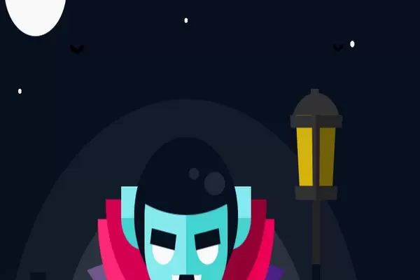
Украшение для сайта на Хеллоуин в виде Дракулы и жуткой фоновой музыки могут стать неотъемлемой частью вашего веб проекта. Мне нравится этот сниппет Дракулы. Автор этого кода использовал HTML, CSS и JS. Цвета, симметрия и художественный стиль идеальны. Кроме того, фоновая музыка, которая воспроизводится при нажатии, идеально подходит для создания жуткого ощущения.
HTML(Pug)
audio#myAudio
    source(src="https://raw.githubusercontent.com/ricardoolivaalonso/Codepen/master/Vampire/vampire.mp3",type="audio/mpeg")

div.main
    div.stars
    div.bg.bg--1
    div.bg.bg--2
    div.moon
    div.floor
    div.cloud
    div.lamp
        div.lamp__b
        div.lamp__m
        div.lamp__t
    div.plus
    div.candle
    div.birds
        div.bird
        div.bird
    //-
    div.vampire

        div.vampire__hand.vampire__hand--l
        div.vampire__hand.vampire__hand--r
        div.vampire__b1
        div.vampire__b2
        div.vampire__b3
        div.vampire__b4
        div.vampire__b5

        div.vampire__head

            div.vampire__cf
                div.vampire__face
                div.vampire__eye.vampire__eye--l
                div.vampire__eye.vampire__eye--r
                div.vampire__mouth
            div.vampire__cb
                div.vampire__hair
div.vampire__earsCSS(SCSS)
/* Variables */
$white: #F9F9F9;
$black: #07101F;
$yellow: #F4D637;
$blue-1: #84EAEF;
$blue-2: #43D3D1;
$purple-a1: #281140;
$purple-a2: #12081A;
$purple-b1: #71568D;
$purple-b2: #4B2087;
$pink-1: #FF2875;
$pink-2: #EE0054;
$gray-1: #323232;
$gray-2: #242424;
$red-1: #D50052;
$red-2: #940033;
$floor-1: #003958;
$floor-2: #002644;

$s: 1s;

/* Reset */
*, *::after, *::before {
    margin: 0;
    padding: 0;
    box-sizing: border-box;
}
/* Generic */
body{
    display: flex;
    justify-content: center;
    align-items: center;

    width: 100%;
    height: 100vh;
    background-color: $black;
    cursor: pointer;
    overflow: hidden;
}
.main{
    display: flex;
    justify-content: center;
    align-items: flex-end;
    width: 800px;
    height: 600px;
    position: relative;
    overflow: hidden;

    @media(max-width: 900px){ transform: scale(.7); }
    @media(max-width: 800px){ transform: scale(.6); }
    @media(max-width: 750px){ transform: scale(.5); }
    @media(max-width: 650px){ transform: scale(.45); }

}

.vampire{
    display: flex;
    justify-content: center;
    position: absolute;
    width: 400px;
    height: 300px;
    perspective: 200px;

    &__b1{
        position: absolute;
        bottom: 0px;
        width: 400px;
        height: 200px;
        transform-style: preserve-3d;
        transform: rotateX(30deg) translateZ(-55px);

        background-image: linear-gradient(to right, $purple-a1 50%, $purple-a2 50%);
        z-index: 10;
    }
    &__b2{
        position: absolute;
        bottom: 0px;
        border-top: 170px solid $purple-b1;
        border-left: 170px solid $purple-b2;
        border-bottom: 100px solid transparent;
        border-right: 100px solid transparent;
        transform: rotateZ(-135deg);

        z-index: 20;
        animation: up-down-b $s alternate infinite .1s;
    }
    &__b3{
        position: absolute;
        bottom: 30px;
        border-top: 170px solid $pink-1;
        border-left: 170px solid $pink-2;
        border-bottom: 170px solid transparent;
        border-right: 170px solid transparent;
        transform: rotateZ(-135deg);
        border-radius: 50%;

        z-index: 30;
        animation: up-down-b $s alternate infinite .1s;
    }
    &__b4{
        position: absolute;
        bottom: 70px;
        border-top: 155px solid $red-1;
        border-left: 155px solid $red-2;
        border-bottom: 155px solid transparent;
        border-right: 155px solid transparent;
        transform: rotateZ(-135deg);
        border-radius: 50%;

        z-index: 40;
        animation: up-down-b $s alternate infinite .1s;
    }
    &__b5{
        position: absolute;
        display: flex;
        justify-content: center;
        bottom: 70px;
        border-radius: 50%;
        width: 100px;
        height: 100px;

        background: $white;
        z-index: 45;
        animation: up-down $s alternate infinite;
        &::before{
            content: '';
            position: absolute;
            width: 20px;
            height: 200px;
            background-color: $white;
        }
    }
    &__hand{
        position: absolute;
        bottom: -35px;
        height: 80px;
        width: 80px;
        z-index: 50;
        border-radius: 50%;
        animation: up-down-b $s alternate infinite .15s;

        &--l{ left: 40px; background-color: $blue-1; }
        &--r{ left: 280px; background-color: $blue-2; }
    }
    &__head{
        display: flex;
        justify-content: center;
        position: absolute;
        width: 240px;
        height: 220px;
    }
    &__cf,
    &__cb{
        display: flex;
        justify-content: center;
        position: absolute;
        background-color: $black;
        width: 200px;
        height: 200px;
        border-radius: 50%;

        z-index: 60;
        animation: up-down $s alternate infinite;
    }
    &__face{
        content: '';
        bottom: -20px;
        position: absolute;
        width: 160px;
        height: 200px;
        border-radius: 90px;
        background-image: linear-gradient(to right, $blue-1 50%,  $blue-2 50%);
    }
    &__eye{
        display: flex;
        justify-content: center;
        position: absolute;
        top: 120px;
        width: 42px;
        height: 42px;
        border-radius: 50%;
        background-color: $white;

        z-index: 100;
        animation: eye $s alternate infinite .1s;
        &::before{
            content: '';
            position: absolute;
            width: 48px;
            height: 20px;
            background-color: $black;
        }
        &--l{
            left: 35px;
            &::before{ transform: rotateZ(10deg); }
        }
        &--r{
            left: 120px;
            &::before{ transform: rotateZ(-10deg); }
        }
    }
    &__mouth{
        position: absolute;
        top: 150px;
        border-radius: 50%;
        border-top: 25px solid $black;
        border-left: 25px solid $black;
        border-bottom: 25px solid transparent;
        border-right: 25px solid transparent;
        transform: rotateZ(-135deg);

        animation: eye $s alternate infinite .1s;


        &::before,
        &::after{
            content: '';
            position: absolute;
            left: -4px;
            top: -40px;
            width: 15px;
            border-bottom: 30px solid $white;
            border-top: 0 solid transparent;
            border-left: 7.5px solid transparent;
            border-right: 7.5px solid transparent;
            transform: rotateZ(-45deg);
        }
        &::after{ left: -34px; top: -10px; }
    }

    &__cb{
        overflow: hidden;
        background: none;
    }
    &__hair{
        position: absolute;
        bottom: 100px;
        width: 450px;
        height: 450px;
        border-radius: 50%;
        background-color: $black;

        z-index: 70;
        animation: hair $s alternate infinite;

        &::before,
        &::after{
            content: '';
            position: absolute;
            bottom: 25px;
            right: 150px;
            width: 40px;
            height: 30px;
            border-radius: 50%;
            background: rgba($white, .1);

            z-index: 80;
        }
        &::after{
            bottom: 45px;
            right: 200px;
            width: 20px;
            height: 15px;
        }
    }
    &__ears{
        position: absolute;
        top: 65px;
        width: 250px;
        height: 80px;
        border-bottom-left-radius: 40px;
        border-bottom-right-radius: 40px;
        background-image: linear-gradient(to bottom, $blue-1 50%,  $blue-2 50%);

        z-index: 50;
        animation: up-down $s alternate infinite .1s;
    }
}
.bg{
    position: absolute;
    border-radius: 50%;
    background: rgba($white, .1);
    &--1{
        bottom: -250px;
        width: 500px;
        height: 500px;
        animation: bg $s alternate infinite;
    }
    &--2{
        bottom: -350px;
        width: 700px;
        height: 700px;
        animation: bg $s alternate infinite .5s;
    }

}
.moon{
    position: absolute;
    top: 50px;;
    left: 50px;
    width: 120px;
    height: 120px;
    border-radius: 50%;
    background-color: $white;
}
.floor{
    position: absolute;
    bottom: 0px;
    width: 100%;
    height: 40px;
    border-top: 20px solid $black;
    background-image: linear-gradient(to right, $floor-1 5%, $floor-2 5%, $floor-2 95%, $floor-1 95%);
}

.plus{
    display: flex;
    justify-content: center;
    position: absolute;
    bottom: 40px;
    left: 100px;
    width: 30px;
    height: 90px;
    background:  $black;

    &::before{
        content: '';
        position: absolute;
        width: 70px;
        height: 30px;
        top: 20px;
        background: $black;
    }
}
.bird{
    position: absolute;
    bottom: 400px;
    right: 100px;
    width: 15px;
    height: 15px;
    border-top: 5px solid black;
    border-left: 5px solid black;
    transform: rotateZ(-135deg);
    border-radius: 5px;
    z-index: -1;
    animation: bird .75s ease alternate infinite;

    &:nth-of-type(2){
        bottom: 400px;
        right: 600px;
        width: 20px;
        height: 20px;
        border-top: 7px solid black;
        border-left: 7px solid black;
        animation: bird .5s ease alternate infinite;
    }
}
.stars{
    width: 100%;
    height: 100%;
    background-image:
        radial-gradient(circle at 25% 20%, $white 4px ,transparent 4px),
        radial-gradient(circle at 50% 25%, $white 3px , transparent 3px),
        radial-gradient(circle at 10% 40%, $white 3px , transparent 3px),
        radial-gradient(circle at 90% 30%, $white 4px , transparent 4px)
    ;
    border-radius: 50%;
}
.candle{
    display: flex;
    justify-content: center;
    position: absolute;
    bottom: 0px;
    left: 40px;
    height: 15px;
    width: 50px;
    z-index: 100;
    background-image: linear-gradient(to right, lighten($pink-1, 2) 50%,  lighten($pink-1, 10) 50%);

    &::before{
        content: '';
        bottom: 15px;
        position: absolute;
        height: 30px;
        width: 20px;
        background-color: $white;
    }
    &::after{
        content: '';
        position: absolute;
        bottom: 55px;
        height: 20px;
        width: 20px;
        border-radius: 30% 70% 0% 100% / 30% 100% 0% 70% ;
        transform: rotateZ(-45deg);
        background-color: $yellow;
        box-shadow:
            0 0 5px 5px rgba($white, .3),
            0 0 15px 15px rgba($white, .2),
            0 0 25px 25px rgba($white, .1)
        ;
        animation: up-down-b2 $s / 2 ease-in alternate infinite .1s;
    }
}
.cloud{
    position: absolute;
    top: 80px;
    left: 20px;
    width: 120px;
    height: 40px;
    overflow: hidden;

    animation: cloud $s * 6 ease-in alternate infinite .1s;

    &::before,
    &::after{
        content: '';
        position: absolute;
        background-color: $black;
        border-radius: 50%;
    }
    &::before{
        width: 80px;
        height: 80px;
        left: 0;
    }
    &::after{
        width: 60px;
        height: 60px;
        top: 50%;
        right: 0;
    }
}
.lamp{
    display: flex;
    flex-direction: column-reverse;
    justify-content: flex-start;
    align-items: center;
    position: absolute;
    bottom: 40px;
    right: 100px;
    width: 100px;
    height: 280px;
    perspective: 200px;

    &__b{
        width: 15px;
        height: 200px;
        border-bottom: 100px solid $black;
        border-top: 100px solid $gray-2;
    }
    &__m{
        width: 70px;
        height: 80px;
        background-image: linear-gradient( to right, $yellow calc(50% - 7px), $gray-1 calc(50% - 7px), $gray-1 50%, $gray-2 50%, $gray-2 calc(50% + 7px),  darken($yellow, 25) calc(50% + 7px) );
        transform-style: preserve-3d;
        transform: rotateX(-30deg);

        animation: lamp $s ease-in infinite alternate;

        &::before,
        &::after{
            content: '';
            position: absolute;
            top: 0;
            left: -15%;
            width: 130%;
            height: 12px;
            background-image: linear-gradient( to right, $gray-1 50%, $gray-2 50% );
        }
        &::after{
            top: 100%;
            height: 20px;
        }
    }
    &__t{
        position: absolute;
        top: -38px;
        width: 100px;
        height: 100px;
        border-radius: 50%;
        z-index: -1;
        background-image: linear-gradient(to bottom, $gray-1 30%, transparent 30%);

        &::before{
            content: '';
            position: absolute;
            top: -5px;
            width: 15px;
            height: 10px;
            left: calc(50% - 10px);
            background-color: $gray-1;
        }
    }
}
/**/
@keyframes lamp{
    0%, 20%, 50%, 80%{ background-image: linear-gradient( to right, $yellow calc(50% - 7px), $gray-1 calc(50% - 7px), $gray-1 50%, $gray-2 50%, $gray-2 calc(50% + 7px),  darken($yellow, 25) calc(50% + 7px) ); }
    10%, 40%, 70%, 100%{ background-image: linear-gradient( to right, darken($yellow, 15) calc(50% - 7px), $gray-1 calc(50% - 7px), $gray-1 50%, $gray-2 50%, $gray-2 calc(50% + 7px),  darken($yellow, 35) calc(50% + 7px) ); }
}
@keyframes bg{
    0%, 30%{ background: rgba($white, .1); }
    70%, 100%{ background: rgba($white, .05); }
}
@keyframes cloud{
    0%, 30%{ left: 0;}
    70%, 100%{ left: 50px; }
}
@keyframes up-down {
    0%{ transform: translateY(0); }
    100%{ transform: translateY(-10px); }
}
@keyframes hair {
    0%{ transform: translateY(0); }
    100%{ transform: translateY(-5px); }
}
@keyframes eyes {
    0%{ transform: translateY(0); }
    100%{ transform: translateY(-3px); }
}
@keyframes up-down-b {
    0%{ transform: rotateZ(-135deg) translateY(-3px) translateX(-3px); }
    100%{ transform: rotateZ(-135deg) translateY(0) translateX(0); }
}
@keyframes up-down-b2 {
    0%{
        opacity: .8;
        transform: rotateZ(-135deg) translateY(1px) translateX(1px);
    }
    100%{
        opacity: 1;
        transform: rotateZ(-135deg) translateY(0) translateX(0);
    }
}
@keyframes bird {
    0%{ transform: scaleY(.7) rotateZ(-135deg) translateX(0) translateY(0) skew(-10deg,-10deg );}
    100%{ transform: scaleY(1) rotateZ(-135deg) translateX(50%) translateY(50%) skew(-10deg,-10deg );}
}
JS
/*
Designed by: Andreas Maris
Original image: https://dribbble.com/shots/7864355-It-s-Halloween-season
*/


var x = document.getElementById("myAudio");
function playAudio() {
   x.loop = true;
   x.play();
}
document.body.addEventListener("click", playAudio)


Комментарии
all-
цитироватьТестируйте на 18 версии у кого есть возможность) если что подправим

 честно нет времени вообще. Ну вы еще ждёте?)) Я обновил, пробуйте
-
цитироватьТимофей, Мой взгляд, тогда у людей была Родина, было за что сражаться... и не важно какой был отдан приказ.... взять любой ценой... у меня два деда и две бабки были .. прошли всё это... они сделали это ради нас ... за нашу Родину!!! А наша Родина это наша Родина!


admin
27 мая 2025 21:56