


Украшение для сайта на Хэллоуин - Франкенштейн
2-ноября-2023, 21:21 12 0
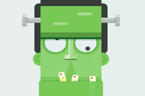
Украшение для сайта на Хэллоуин в виде анимированной головы Франкенштейна. Это самая милая анимация Франкенштейна. Этот код был создан Рикардо Оливией Алонсо. Создатель этого кода создает иллюстрации и анимацию с использованием HTML (Pug) и CSS (SCSS).
HTML (Pug)
body.flex
    div.main.flex

        div.frank

            div.head.flex
                div.head__t
                div.head__m
                    div.face
                        div.eye.flex
                            div.eye__l
                            div.eye__r
                        div.nose.flex
                            div.nose__t
                            div.nose__b
                        div.mouth
                        div.teeth
                            div.teeth__l
                            div.teeth__m
                            div.teeth__r
                div.head__b

            div.hair.flex
                div.hair__t
                div.hair__m.black
                div.hair__b.black

            div.ear.flex
                div.ear__l
                div.ear__r

            div.screws
                div.screws__l
                div.screws__r
CSS (SCSS)
/* Variables */
$bg: #E4EFEE;
$black: #363C38;

$green-1: #8FD274;
$green-2: #78C858;
$green-3: #65B34F;
$green-4: #569740;
$green-5: #00671E;
$green-n1: #D0EEC2;
$green-n2: #A9DB91;

$teeth-1: #FDFED9;
$teeth-2: #FFF38C;
$teeth-red: #D30924;

$gray-1: #D0DBD6;
$gray-2: #b7c1bc;
$gray-3: #939E99;

/* Reset */
*, *::after, *::before {
    margin: 0;
    padding: 0;
    box-sizing: border-box;
}
.flex{
    display: flex;
    justify-content: center;
    align-items: center;
}
.black{
    background-color: $black;
    position: relative;
}
/* Generic */
body{
    width: 100%;
    height: 100vh;
    background-color: $bg;
    font-family: 'Permanent Marker', cursive;
    font-size: 16px;
}

.main{
    width: 800px;
    height: 600px;
        @media(max-width: 800px){ transform: scale(.6); }
        @media(max-width: 500px){ transform: scale(.5); }
        @media(max-width: 400px){ transform: scale(.4); }
}
.frank{
    position: relative;
    width: 250px;
    height: 480px;
}
.head{
    flex-direction: column;
    position: absolute;
    left: 50%;
    bottom: 0;
    width: 210px;
    height: 400px;
    transform: translateX(-50%);
    z-index: 100;
    &__t{
        position: relative;
        width: 200px;
        height: 125px;
        background-image:
            linear-gradient(
            to bottom,
            $green-2 0%,
            $green-2 80%,
            $green-4 80%,
            $green-4 95%,
            $green-5 95%,
            $green-5 100%
            );
        box-shadow: 0 5px 0 rgba($black, .25);
        z-index: 50;

        &::before,
        &::after{
            content: '';
            position: absolute;
            width: 50px;
            height: 10px;
            background: $green-n2;
            border-radius: 5px;
            top: 50%;
            left: 20%;
        }
        &::after{
            top: 20%;
            left: 60%;
        }
    }
    &__m{
        width: 200px;
        height: 160px;
        background-image:
            linear-gradient(
            to bottom,
            $green-1 0%,
            $green-1 90%,
            $green-2 90%,
            $green-2 98%,
            $green-3 98%,
            $green-3 100%
            );
    }
    &__b{
        position: relative;
        width: 100%;
        height: 115px;
        background-image:
            linear-gradient(
            to bottom,
            $green-2 0%,
            $green-2 85%,
            $green-3 85%,
            $green-3 100%,
            );

        &::before{
            content: '';
            position: absolute;
            left: calc(50% - 35px);
            bottom: -18px;
            border-top: 35px solid $green-1;
            border-left: 35px solid $green-1;
            border-right: 35px solid transparent;
            border-bottom: 35px solid transparent;
            border-radius: 50%;
            transform: rotateZ(45deg);
        }
        &::after{
            content: '';
            position: absolute;
            top: 0;
            right: 25px;
            width: 20px;
            height: 50%;
            background: $green-1;
            border-bottom-left-radius: 10px;
            border-bottom-right-radius: 10px;
            animation: drop-1 4s infinite,drop-2 4s infinite;
        }
    }
}
    .face{
        width: 100%;
        height: 100%;
        position: relative;
    }
        .eye{
            position: relative;
            width: 100%;
            height: 50px;

            &__l,
            &__r{
                position: absolute;
                bottom: 0;
                left: 7%;
                height: 70px;
                width: 70px;
                background-color: $bg;
                border-radius: 50%;
                box-shadow:
                0 0 0 5px $green-3,
                0 0 0 10px $green-2;
                animation: eye 4s infinite alternate;

                &::before{
                    content: '';
                    position: absolute;
                    top: 35%;
                    left: 65%;
                    height: 15px;
                    width: 15px;
                    background-color: $black;
                    border-radius: 50%;
                }
            }
            &__r{
                left: 57%;
                &::before{
                    top: 60%;
                    left: 15%;
                }
            }
        }
        .nose{
            position: absolute;
            flex-direction: column;
            top: 0;
            left: 50%;
            width: 40px;
            height: 80px;
            transform: translateX(-50%);

            &__t{
                width: 15px;
                height: 60px;
                background-image:
                    linear-gradient(
                        to right,
                        $green-n1 30%,
                        $green-n2 30%,
                );
            }
            &__b{
                width: 100%;
                height: 20px;
                background-image:
                    linear-gradient(
                        to right,
                        $green-n1 43%,
                        $green-n2 43%,
                );
                border-bottom: 5px solid $green-4;
            }
        }
        .mouth{
            position: absolute;
            left: 50%;
            bottom: -20px;
            border-top: 35px solid $green-2;
            border-left: 35px solid $green-2;
            border-right: 35px solid transparent;
            border-bottom: 35px solid transparent;
            transform:
                translateX(-50%)
                scaleX(.4)
                scaleY(1.3)
                rotateZ(45deg);
        }
        .teeth{
            position: absolute;
            bottom: 0;
            width: 100%;
            height: 40px;

            &__l,
            &__m,
            &__r{
                position: absolute;
                width: 20px;
                height: 40px;
                background: red;
                border-radius: 5px;
                background-image:
                    linear-gradient(
                    to bottom,
                    $teeth-1 0%,
                    $teeth-1 60%,
                    $teeth-2 60%,
                    $teeth-2 100%,
                );

                &::before,
                &::after{
                    content: '';
                    position: absolute;
                    top: 5px;
                    left: 5px;
                    height: 5px;
                    width: 5px;
                    border-radius: 50%;
                    background-color: $teeth-red;
                }
                &::after{
                    left: 10px;
                    top: 20px;
                    height: 3px;
                    width: 3px;
                }
            }
            &__l{
                left: 30%;
                bottom: -5px;
                transform: rotateZ(-15deg);
                animation: teeth-1 .1s infinite;

            }
            &__m{
                left: 50%;
                bottom: -15px;
                transform: rotateZ(15deg);
                animation: teeth-2 .1s infinite;

            }
            &__r{
                left: 80%;
                bottom: -20px;
                transform: rotateZ(-5deg);
                animation: teeth-3 .1s infinite;

            }
        }

.hair{
    flex-direction: column;
    justify-content: flex-start;
    position: absolute;
    top: 0;
    left: 0;
    width: 100%;
    height: 260px;

    &__t{
        height: 50px;
        width: 100px;
        position: relative;
        animation: screws .1s infinite;

        &::before{
            content: '';
            position: absolute;
            right: 0%;
            top: 0;
            height: 70px;
            width: 70px;
            background-color: $black;
            border-radius: 50%;
        }
        &::after{
            content: '';
            position: absolute;
            left: 0;
            border-top: 35px solid $black;
            border-left: 35px solid $black;
            border-right: 35px solid transparent;
            border-bottom: 35px solid transparent;
            border-radius: 50%;
            transform: rotateZ(-45deg);
        }
    }
    &__m{
        height: 30px;
        width: 200px;
        border-radius: 10px;
    }
    &__b{
        position: absolute;
        bottom: 0;
        width: 240px;
        height: 190px;
        border-radius: 15px;
    }
}

.ear{
    position: absolute;
    justify-content: space-between;
    top: 255px;
    width: 100%;
    height: 50px;

    &__l,
    &__r{
        height: 50px;
        width: 50px;
        border-radius: 50%;
        background-image:
            radial-gradient(
                circle,
                $green-2 0%,
                $green-2 30%,
                $green-3 30%,
                $green-3 40%,
                $green-2 40%,
                $green-2 100%,

        );
        animation: screws .1s infinite;

    }
}
.screws{
    position: absolute;
    top: 110px;
    width: 100%;
    height: 45px;

    &__l,
    &__r{
        position: absolute;
        height: 45px;
        width: 60px;
        top: 0;
        left: -35px;
        animation: screws .1s infinite;
        &::before{
            content: '';
            position: absolute;
            width: 15px;
            height: 100%;
            background-image:
                linear-gradient(
                to bottom,
                $gray-1 0%,
                $gray-1 25%,
                $gray-2 25%,
                $gray-2 92%,
                $gray-3 92%,
                $gray-3 100%
                );
        }
        &::after{
            content: '';
            position: absolute;
            right: 0;
            top: calc(50% - 10px);
            width: 45px;
            height: 20px;
            background-image:
                linear-gradient(
                to bottom,
                $gray-1 0%,
                $gray-1 25%,
                $gray-2 25%,
                $gray-2 85%,
                $gray-3 85%,
                $gray-3 100%
                );
            border-left: 3px solid $gray-3;
        }
    }
    &__r{
        left: calc(100% - 25px);
        &::before{ right: 0; }
        &::after{
            left: 0;
            border-left: none;
            border-right: 3px solid $gray-3;
        }
    }
}

/**/

@keyframes eye {
    0%{ transform: rotateZ(-.25turn);}
    100%{ transform: rotateZ(.25turn);}
}
@keyframes teeth-1 {
    0%{ transform: rotateZ(-15deg) translateX(0);}
    100%{ transform: rotateZ(-15deg) translateX(2px);}
}
@keyframes teeth-2 {
    0%{ transform: rotateZ(15deg) translateX(0);}
    100%{ transform: rotateZ(15deg) translateX(2px);}
}
@keyframes teeth-3 {
    0%{ transform: rotateZ(-5deg) translateX(0);}
    100%{ transform: rotateZ(-5deg) translateX(2px);}
}
@keyframes screws {
    0%{ transform: translateY(0);}
    100%{ transform: translateY(1px);}
}
@keyframes drop-1 {
    0%{ height: 10%; }
    100%{ height: 50%; }
}
@keyframes drop-2 {
    0%, 80%{ opacity: 1;}
    100%{ opacity: 0; }
}


Комментарии
all-
цитироватьТестируйте на 18 версии у кого есть возможность) если что подправим

 честно нет времени вообще. Ну вы еще ждёте?)) Я обновил, пробуйте
-
цитироватьТимофей, Мой взгляд, тогда у людей была Родина, было за что сражаться... и не важно какой был отдан приказ.... взять любой ценой... у меня два деда и две бабки были .. прошли всё это... они сделали это ради нас ... за нашу Родину!!! А наша Родина это наша Родина!


admin
27 мая 2025 21:56