


Анимация чёрной кошки в темноте на css и html
16-сентября-2025, 19:40 47 0
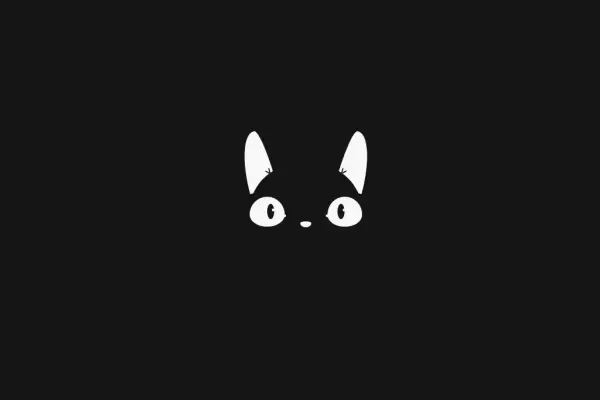
Интересная анимация черной кошки в темноте, которая моргает и водит своими глазками. Анимация создана с применением css и html . Кошка может стать отличным дополнением в оформлении сайта или тематического блога. Установка займет немного времени. Ниже представлен код анимированной черной кошки.
HTML
<div class="cat">

 <div class="ear ear--left"></div>
 <div class="ear ear--right"></div>

 <div class="face">

 <div class="eye eye--left">
 <div class="eye-pupil"></div>
 </div>
 <div class="eye eye--right">
 <div class="eye-pupil"></div>
 </div>
 <div class="muzzle"></div>

 </div>

</div>
CSS
html {
    height: 100%;
    display: flex;
    align-items: center;
    justify-content: center;
    background: #694198;
}

.cat {
    position: relative;
    height: 170px;
    width: 192.1px;
        margin-top: 50px;
}

.ear {
    position: absolute;
    top: -30%;
    height: 60%;
    width: 25%;
    background: #fff;
}

.ear::before,
.ear::after {
    content: '';
    position: absolute;
    bottom: 24%;
    height: 10%;
    width: 5%;
    border-radius: 50%;
    background: #694198;
}

.ear::after {
    transform-origin: 50% 100%;
}

.ear--left {
    left: -7%;
    border-radius: 70% 30% 0% 0% / 100% 100% 0% 0%;
    transform: rotate(-15deg);
}

.ear--left::before,
.ear--left::after {
    right: 10%;
}

.ear--left::after {
    transform: rotate(-45deg);
}

.ear--right {
    right: -7%;
    border-radius: 30% 70% 0% 0% / 100% 100% 0% 0%;
    transform: rotate(15deg);
}

.ear--right::before,
.ear--right::after {
    left: 10%;
}

.ear--right::after {
    transform: rotate(45deg);
}

.face {
    position: absolute;
    height: 100%;
    width: 100%;
    background: #694198;
    border-radius: 50%;
}

.eye {
    position: absolute;
    top: 35%;
    height: 30%;
    width: 31%;
    background: #fff;
    border-radius: 50% 50% 50% 50% / 60% 60% 40% 40%;
}

.eye::after {
    content: '';
    position: absolute;
    top: 0;
    left: 0;
    height: 0;
    width: 100%;
    border-radius: 0 0 50% 50% / 0 0 40% 40%;
    background: #694198;
    animation: blink 4s infinite ease-in;
}

@keyframes blink {
    0% {
        height: 0;
    }
    90% {
        height: 0;
    }
    92.5% {
        height: 100%;
    }
    95% {
        height: 0;
    }
    97.5% {
        height: 100%;
    }
    100% {
        height: 0;
    }
}

.eye::before {
    content: '';
    position: absolute;
    top: 60%;
    height: 10%;
    width: 15%;
    background: #fff;
    border-radius: 50%;
}

.eye--left {
    left: 0;
}

.eye--left::before {
    right: -5%;
}

.eye--right {
    right: 0;
}

.eye--right::before {
    left: -5%;
}

.eye-pupil {
    position: absolute;
    top: 25%;
    height: 50%;
    width: 20%;
    background: #694198;
    border-radius: 50%;
    animation: look-around 4s infinite;
}

@keyframes look-around {
    0% {
        transform: translate(0);
    }
    5% {
        transform: translate(50%, -25%);
    }
    10% {
        transform: translate(50%, -25%);
    }
    15% {
        transform: translate(-100%, -25%);
    }
    20% {
        transform: translate(-100%, -25%);
    }
    25% {
        transform: translate(0, 0);
    }
    100% {
        transform: translate(0, 0);
    }
}

.eye--left .eye-pupil {
    right: 30%;
}

.eye--right .eye-pupil {
    left: 30%;
}

.eye-pupil::after {
    content: '';
    position: absolute;
    top: 30%;
    right: -5%;
    height: 20%;
    width: 35%;
    border-radius: 50%;
    background: #fff;
}

.muzzle {
    position: absolute;
    top: 60%;
    left: 50%;
    height: 6%;
    width: 10%;
    background: #fff;
    transform: translateX(-50%);
    border-radius: 50% 50% 50% 50% / 30% 30% 70% 70%;
}


Комментарии
all-
цитироватьТестируйте на 18 версии у кого есть возможность) если что подправим

 честно нет времени вообще. Ну вы еще ждёте?)) Я обновил, пробуйте
-
цитироватьТимофей, Мой взгляд, тогда у людей была Родина, было за что сражаться... и не важно какой был отдан приказ.... взять любой ценой... у меня два деда и две бабки были .. прошли всё это... они сделали это ради нас ... за нашу Родину!!! А наша Родина это наша Родина!


admin
27 мая 2025 21:56