


Кошачий CSS Арт
25-сентября-2023, 21:06 35 0
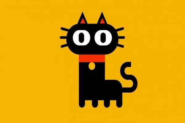
В продолжении кошачьего стиля нашёл еще одно решение для оформления сайта при помощи CSS и красивой кошечки.
Для установки скопируйте приведенный ниже код и вставьте его в свой HTML-файл. Всё начинается с создания контейнера div. Контейнер div имеет несколько элементов div, которые используются для создания всех частей тела кошки.
HTML
<!DOCTYPE html>
<html lang="en">
  <head>
    <meta name="viewport" content="width=device-width, initial-scale=1.0" />
    <title>Cat CSS Art</title>
    <!-- Stylesheet -->
    <link rel="stylesheet" href="style.css" />
  </head>
  <body>
    <div class="container">
      <div class="cat">
        <div class="whiskers"></div>
        <div class="face">
          <div class="ear-l"></div>
          <div class="ear-r"></div>
        </div>
        <div class="tag"></div>
        <div class="tail"></div>
      </div>
    </div>
  </body>
</html>
Далее мы стилизуем нашего кота с помощью CSS. Для этого скопируйте код, предоставленный вам ниже, и вставьте его в свою таблицу стилей.
CSS
* {
  padding: 0;
  margin: 0;
  box-sizing: border-box;
}
body {
  background-color: #f5b400;
}
.container {
  height: 31.25em;
  width: 31.25em;
  position: absolute;
  transform: translate(-50%, -50%);
  left: 50%;
  top: 50%;
}
.cat {
  background-color: #000000;
  height: 5em;
  width: 12.5em;
  position: absolute;
  transform: translateX(-50%);
  left: 50%;
  top: 18.75em;
  border-radius: 0 2.18em 0 0;
}
.cat:before {
  content: "";
  position: absolute;
  height: 1.87em;
  width: 1.75em;
  background-color: #000000;
  border-radius: 0 0 1.25em 1.25em;
  bottom: -1.18em;
  box-shadow: 3.75em 0 #000000, 7.18em 0 #000000, 10.75em 0 #000000;
}
.cat:after {
  content: "";
  position: absolute;
  height: 6.25em;
  width: 7.5em;
  background: linear-gradient(#f52d00 1.87em, #000000 1.87em);
  bottom: 4.93em;
}
.face {
  position: absolute;
  background-color: #000000;
  height: 7.5em;
  width: 15em;
  bottom: 11.18em;
  left: -3.62em;
  border-radius: 3.75em;
}
.face:before {
  position: absolute;
  content: "";
  height: 3.75em;
  width: 5em;
  background-color: #ffffff;
  border-radius: 1.87em;
  left: 1.87em;
  top: 1.56em;
  box-shadow: 6.25em 0 #ffffff;
}
.face:after {
  position: absolute;
  content: "";
  height: 2.5em;
  width: 1.56em;
  background-color: #000000;
  top: 2.18em;
  left: 3.56em;
  border-radius: 0.93em;
  box-shadow: 6.25em 0 #000000;
}
.whiskers,
.whiskers:before,
.whiskers:after {
  position: absolute;
  height: 0.62em;
  width: 18.75em;
  background-color: #000000;
  border-radius: 0.31em;
}
.whiskers {
  bottom: 15em;
  left: -5.5em;
}
.whiskers:before {
  position: absolute;
  content: "";
  transform: rotate(14deg);
}
.whiskers:after {
  position: absolute;
  content: "";
  transform: rotate(-14deg);
}
.ear-l {
  height: 0;
  width: 0;
  border-bottom: 3.12em solid #000000;
  border-left: 1.56em solid transparent;
  border-right: 1.56em solid transparent;
  position: absolute;
  bottom: 7.37em;
  left: 3.12em;
}
.ear-l:before,
.ear-r:before {
  position: absolute;
  content: "";
  height: 0;
  width: 0;
  border-bottom: 1.37em solid #f52d00;
  border-left: 0.75em solid transparent;
  border-right: 0.75em solid transparent;
  left: -0.68em;
  top: 1.56em;
}
.ear-r {
  height: 0;
  width: 0;
  border-bottom: 3.12em solid #000000;
  border-right: 1.56em solid transparent;
  border-left: 1.56em solid transparent;
  position: absolute;
  bottom: 7.37em;
  left: 8.75em;
}
.tag {
  position: absolute;
  height: 1.87em;
  width: 1.87em;
  background-color: #f5b400;
  border-radius: 50%;
  z-index: 1;
  bottom: 7.43em;
  left: 2.81em;
}
.tail {
  width: 3.75em;
  height: 1.25em;
  background-color: #000000;
  position: absolute;
  left: 10.62em;
  top: 1.87em;
}
.tail:before,
.tail:after {
  position: absolute;
  content: "";
  height: 1.87em;
  width: 1.87em;
  border: 1.25em solid #000000;
}
.tail:before {
  border-left: none;
  bottom: 0;
  left: 3.12em;
  border-radius: 0 3.12em 3.12em 0;
}
.tail:after {
  border-right: none;
  bottom: 3.12em;
  left: 1.25em;
  border-radius: 3.12em 0 0 3.12em;
}
@media screen and (min-width: 600px) {
  .container {
    font-size: 1.2em;
  }
}


Комментарии
all-
цитироватьТестируйте на 18 версии у кого есть возможность) если что подправим

 честно нет времени вообще. Ну вы еще ждёте?)) Я обновил, пробуйте
-
цитироватьТимофей, Мой взгляд, тогда у людей была Родина, было за что сражаться... и не важно какой был отдан приказ.... взять любой ценой... у меня два деда и две бабки были .. прошли всё это... они сделали это ради нас ... за нашу Родину!!! А наша Родина это наша Родина!


admin
27 мая 2025 21:56