


Новогодние анимированные шары для сайта
1-мая-2026, 18:51 17 0
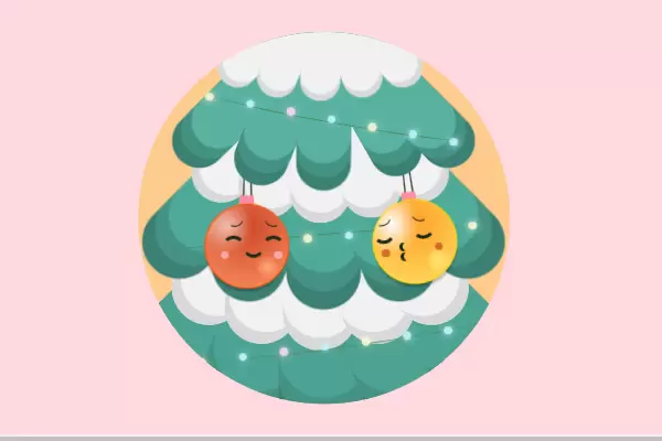
Вот милый красивый анимированный элемент в виде новогодних шаров. Он включает в себя несколько плавных форм и анимацию, которые придают ему динамичный вид. Все визуальные части размещены так, чтобы создать целостную картину. Украсьте свой веб сайт этими прекрасными новогодними шарами, которые привнесут новогоднего настроения, теплоты и любви в зимние морозы! Всех с наступающими зимними праздниками!
HTML
<!DOCTYPE html>
<html lang="en">
  <head>
    <meta charset="UTF-8" />
    <meta name="viewport" content="width=device-width, initial-scale=1.0" />
    <meta http-equiv="X-UA-Compatible" content="ie=edge" />
    <title>Document</title>
    <link rel="stylesheet" href="style.css" />
  </head>
  <body>
    <div class="container">
      <div class="tree-layer">
        <div class="leaf"></div>
        <div class="leaf"></div>
        <div class="leaf"></div>
        <div class="leaf"></div>
        <div class="leaf"></div>
      </div>
      <div class="tree-layer">
        <div class="leaf"></div>
        <div class="leaf"></div>
        <div class="leaf"></div>
        <div class="leaf"></div>
        <div class="leaf"></div>
      </div>
      <div class="tree-layer">
        <div class="leaf"></div>
        <div class="leaf"></div>
        <div class="leaf"></div>
        <div class="leaf"></div>
        <div class="leaf"></div>
      </div>
      <div class="tree-layer">
        <div class="leaf"></div>
        <div class="leaf"></div>
        <div class="leaf"></div>
        <div class="leaf"></div>
        <div class="leaf"></div>
      </div>
      <div class="tree-layer">
        <div class="leaf"></div>
        <div class="leaf"></div>
        <div class="leaf"></div>
        <div class="leaf"></div>
        <div class="leaf"></div>
      </div>
      <div class="tree-layer">
        <div class="leaf"></div>
        <div class="leaf"></div>
        <div class="leaf"></div>
        <div class="leaf"></div>
        <div class="leaf"></div>
      </div>
      <div class="ornaments">
        <div class="ornament-box">
          <div class="string"></div>
          <div class="ornament">
            <div class="face">
              <div class="eyes"></div>
              <div class="shy-brows"></div>
              <div class="shy-eyes"></div>
              <div class="smile"></div>
              <div class="tear"></div>
            </div>
          </div>
        </div>
        <div class="ornament-box">
          <div class="string"></div>
          <div class="ornament">
            <div class="face">
              <div class="eyes"></div>
              <div class="sly-brows"></div>
              <div class="lovey-dovey-eyes"></div>
              <div class="blush"></div>
              <div class="smile"></div>
              <div class="kiss">
                <div class="lip"></div>
                <div class="lip"></div>
              </div>
            </div>
          </div>
        </div>
      </div>
      <div class="lights dip">
        <div class="cord">
          <div class="light"></div>
          <div class="light"></div>
          <div class="light"></div>
          <div class="light"></div>
          <div class="light"></div>
          <div class="light"></div>
          <div class="light"></div>
          <div class="light"></div>
        </div>
      </div>
      <div class="lights-2 dip">
        <div class="cord">
          <div class="light"></div>
          <div class="light"></div>
          <div class="light"></div>
          <div class="light"></div>
          <div class="light"></div>
          <div class="light"></div>
          <div class="light"></div>
          <div class="light"></div>
        </div>
      </div>
      <div class="lights-3">
        <div class="cord">
          <div class="light"></div>
          <div class="light"></div>
          <div class="light"></div>
          <div class="light"></div>
          <div class="light"></div>
          <div class="light"></div>
          <div class="light"></div>
          <div class="light"></div>
        </div>
      </div>
    </div>
  </body>
</html>
SCSS
$bg: rgb(255, 217, 223);
$bg-container: lighten(#fe9e26, 20%);
$tree: rgb(88, 177, 161);
$ornament-size: 100px;
$tree-box-shadow: inset 0px -15px darken($tree, 10%), 0px 15px darken($tree, 15%);
$snow-shadow: inset 0px -10px darken(#fefefe, 15%);

$hue-red: 20;
$bubble-outline-red: hsl($hue-red, 100%, 50%);
$bubble-spot-red: hsl($hue-red, 100%, 75%);
$bubble-shade-red: hsl($hue-red, 100%, 70%);

$hue-yellow: 50;
$bubble-outline-yellow: hsl($hue-yellow, 100%, 50%);
$bubble-spot-yellow: hsl($hue-yellow, 100%, 75%);
$bubble-shade-yellow: hsl($hue-yellow, 100%, 70%);

$timing: 3s;

$light-colors: #fdf8d1, #ffd5f7, #e1ffbc, #c4f4ff;

$tear: #77e0ee;

html,
body {
  width: 100%;
  height: 100%;
  background-color: $bg;
}

* {
  position: absolute;

  &:before,
  &:after {
    content: "";
    position: absolute;
  }
}

@function randomNum($min, $max) {
  $rand: random();
  @return ($min + floor($rand * (($max - $min) + 1)));
}

@mixin lightColor($color) {
  background-color: $color;
  box-shadow: 0px 0px 10px $color;
}

@mixin addGlow($color) {
  @keyframes glowing {
    50% {
      background: lighten($color, 10%);
      box-shadow: 0px 0px 100px rgba($color, 1);
    }
  }

  animation: glowing 3s ease-in-out infinite;
}

@mixin center() {
  transform: translate(-50%, -50%);
  top: 50%;
  left: 50%;
}

@mixin centerY() {
  transform: translateY(-50%);
  top: 50%;
}

@mixin centerX() {
  transform: translateX(-50%);
  left: 50%;
}

@mixin leaves($scale: false, $scalar: 0, $box-shadow: none) {
  $angle: 45deg;
  @for $i from 1 through 5 {
    &:nth-child(#{$i}) {
      @if ($scale) {
        transform: rotate($angle) scale($scalar);
      } @else {
        transform: rotate($angle);
      }
      box-shadow: $box-shadow;
    }
    $angle: $angle - 22.5;
  }
}

.container {
  width: 450px;
  height: 450px;
  @include center();
  background-color: $bg-container;
  border-radius: 100%;
  overflow: hidden;
}

.shadow {
  position: relative;
  width: 80%;
  height: 20%;
  border-radius: 100%;
  opacity: .1;
  background-color: black;
}

.tree-layer {
  width: 300px;
  height: auto;
  @include centerX();
  display: flex;
  top: -10%;

  .leaf {
    position: relative;
    width: 60px;
    height: 200px;
    background-color: $tree;
    border-radius: 200px;
    margin: auto -3%;
    left: 45px;
    top: 10px;
    @include leaves(true, 1.1, $tree-box-shadow);
  }

  &:nth-child(1) {
    z-index: 3;
    & > .leaf:nth-child(2) {
      animation: dipBranch $timing 1.6s infinite;
    }
    & > .leaf:nth-child(4) {
      animation: dipBranch2 $timing .5s infinite;
    }
    animation: dipLayer $timing infinite;
  }

    &:nth-child(2) {
    z-index: 3;
    & > .leaf {
      background-color: darken(#fefefe, 5%);
      @include leaves(true, .8, $snow-shadow);
      margin: auto -5%;
      left: 70px;
      top: -50px;
    }
    animation: dipLayer $timing ease-in-out infinite;
  }

  &:nth-child(3) {
    top: 12%;
    & > .leaf {
      background-color: darken($tree, 3%);
      @include leaves(true, 1.5, $tree-box-shadow);
    }
    animation: dipLayer $timing ease-in-out infinite;
  }

  &:nth-child(4) {
    & > .leaf {
      background-color: darken(#fefefe, 5%);
      @include leaves(true, 1.2, $snow-shadow);
      margin: auto -5%;
      left: 70px;
      top: 55px;
    }
    animation: dipLayer $timing infinite;

  }

    &:nth-child(5) {
      z-index: -1;
    & > .leaf {
      background-color: darken(#fefefe, 5%);
      @include leaves(true, 1.5, $snow-shadow);
      margin: auto -5%;
      left: 70px;
      top: 180px;
    }
  }

  &:nth-child(6) {
    z-index: -2;
    top: 40%;
    & > .leaf {
      background-color: darken($tree, 5%);
      @include leaves(true, 1.8, $tree-box-shadow);
    }
  }
}

.ornaments {
  width: 100%;
  height: 40%;
  top: 40%;
  z-index: 2;

  .ornament-box {
    transform-origin: top;
    top: -30px;
    &:nth-child(1) {
      left: 18%;
      & > .ornament {
        z-index: 2;
        position: relative;
        width: $ornament-size;
        height: $ornament-size;
        box-shadow: 0px 5px 2px rgba(black, .2);
        border-radius: 100%;
        border: 1px solid $bubble-outline-red;
        background-color: #cd4626;
        background-image: radial-gradient(
            100% 100% at 25% 25%,
            lighten(#cd4626, 35%),
            transparent 33%
          ),
          radial-gradient(15% 15% at 75% 75%, $bubble-spot-red, transparent),
          radial-gradient(
            100% 100% at 50% 25%,
            transparent,
            $bubble-shade-red 98%
          );
        animation: fall $timing ease-in-out infinite;

        & > .face {
          & > .eyes {
            left: 8px;
            animation: removeSmile $timing .5s infinite, blink 3s  ease-in-out infinite;
          }

          & > .smile {
            left: 45px;

            &:before,
            &:after {
              width: 10px;
              height: 10px;
              background-color: pink;
              opacity: .2;
              border-radius: 100%;
              top: 15px;
              animation: blush $timing infinite;
            }

            &:before {
              left: -30px;
            }
            &:after {
              left: 35px;
            }
          }
        }
      }

      & > .string {
        animation: string-stretch $timing ease-in-out infinite;
      }
    }

    &:nth-child(2) {
      animation: pendulum $timing ease-in-out infinite;
      left: 60%;
      & > .ornament {
        z-index: 2;
        position: relative;
        width: $ornament-size;
        height: $ornament-size;
        border-radius: 100%;
        background-color: #fe9e26;
        border: 1px solid $bubble-outline-yellow;
        box-shadow: 0px 5px 2px rgba(black, .2);
        background-image: radial-gradient(
            100% 115% at 25% 25%,
            #fff,
            transparent 33%
          ),
          radial-gradient(15% 15% at 75% 75%, $bubble-spot-yellow, transparent),
          radial-gradient(
            100% 100% at 50% 25%,
            transparent,
            $bubble-shade-yellow 98%
          );

        & > .face {
          & > .eyes {
            left: -10px;
            animation: removeSmile $timing infinite, blink 2s .5s ease-in-out infinite;
            // animation: blink 3s .5s ease-in-out infinite;
          }

          & > .smile {
            left: 28px;
            animation: removeSmile $timing infinite;
          }

          .blush {
            left: 38px;
            top: 40px;
            animation: blush $timing infinite;
            &:before,
            &:after {
              width: 10px;
              height: 10px;
              background-color: #cd4626;
              border-radius: 100%;
              top: 15px;
            }

            &:before {
              left: -30px;
            }
            &:after {
              left: 35px;
            }
          }
        }
      }
    }
  }

  .string {
    position: relative;
    width: 5px;
    height: 50px;
    border: 2px solid darken(#66a671, 30%);
    border-radius: 200px;
    transform: perspective(10px) rotateX(5deg);
    left: 48px;
    transform-origin: top;

    &:after {
      width: 12px;
      height: 12px;
      background-color: darken(pink, 10%);
      top: 60%;
      left: -80%;
    }
  }

  .face {
    width: 100%;
    height: 70%;

    .eyes {
      display: flex;
      justify-content: space-between;
      top: 50%;

      &:before,
      &:after {
        position: relative;
        width: 20px;
        height: 20px;
        background-color: darken(#66a671, 40%);
        background-image: radial-gradient(
            ellipse 3px 3px at 50% 20%,
            #fff 99%,
            transparent
          ),
          radial-gradient(ellipse 1px 1px at 20% 40%, #fff 99%, transparent);
        border-radius: 100%;
        margin: 0 15px;
      }
    }

    .smile {
      width: 20px;
      height: 20px;
      border-radius: 100%;
      border: 3px solid transparent;
      border-bottom: 4px solid darken(#66a671, 40%);
      top: 55%;
    }
  }
}

.lovey-dovey-eyes {
    display: flex;
    justify-content: space-between;
    top: 30px;
    left: -10px;
    animation: kiss $timing infinite;

    &:before,
    &:after {
      position: relative;
      width: 20px;
      height: 20px;
      border-radius: 100%;
      border: 5px solid transparent;
      border-bottom: 5px solid darken(#66a671, 40%);
      margin: 0 10px;
      top: -10px;
    }
}

.sly-brows {
  display: flex;
  justify-content: space-between;
  top: 30px;
  left: -18px;
  opacity: 0;
  animation: kiss $timing infinite;

  &:before,
  &:after {
    position: relative;
    width: 20px;
    height: 20px;
    left: 9px;
    top: -25px;
    border-radius: 100%;
    border: 2px solid transparent;
    border-bottom: 2px solid darken(#66a671, 40%);
    margin: 0 12px;
  }

  &:before {
    transform: rotate(-20deg);
  }
  &:after {
    transform: rotate(20deg);
  }
}

.shy-brows {
  display: flex;
  justify-content: space-between;
  top: 30px;
  left: 3px;
  opacity: 0;
  animation: kiss $timing .5s infinite;

  &:before,
  &:after {
    position: relative;
    width: 20px;
    height: 20px;
    left: 9px;
    top: -25px;
    border-radius: 100%;
    border: 2px solid transparent;
    border-bottom: 2px solid darken(#66a671, 40%);
    margin: 0 12px;
  }

  &:before {
    transform: rotate(-20deg);
  }
  &:after {
    transform: rotate(20deg);
  }
}

.shy-eyes {
  display: flex;
  justify-content: space-between;
  top: 30px;
  left: 3px;
  opacity: 0;
  animation: kiss $timing .5s infinite;

  &:before,
  &:after {
    position: relative;
    width: 20px;
    height: 20px;
    left: 6px;
    top: 8px;
    border-radius: 100%;
    border: 5px solid transparent;
    border-top: 5px solid darken(#66a671, 40%);
    margin: 0 10px;
  }
}
.kiss {
  display: flex;
  flex-direction: column;
  left: 30px;
  top: 50px;
  animation: kiss $timing infinite;

  .lip {
    position: relative;
    width: 15px;
    height: 10px;
    border: 1px solid transparent;
    border-left: 4px solid darken(#66a671, 40%);
    border-radius: 100%;
    margin-top: -1px;
  }
}

.lights {
  width: 100%;
  height: 50px;
  top: 20%;
  z-index: 3;

  .cord {
    width: 73%;
    height: 20px;
    border-radius: 100%;
    border-bottom: 2px solid darken(#66a671, 10%);
    left: 80px;
    transform: rotate(10deg);

    .light {
      width: 10px;
      height: 10px;
      border-radius: 10px;

      $top: 10px;
      $left: 0;
      @for $i from 1 to 8 {
        &:nth-child(#{$i}) {
          top: $top;
          left: $left;
          $index: randomNum(1, 4);
          @include lightColor(nth($light-colors, $index));
        }
        $top: $top + .5px;
        $left: $left + 50px;
      }
      animation: flicker 2s linear infinite;
    }
  }
}

.dip {
  animation: dipLayer $timing infinite;
  left: 50%;
}

.lights-2 {
  @extend .lights;
  top: 55%;
  width: 125%;
  left: 45%;
  z-index: 1;

  & > .cord {
    transform: rotate(-185deg);
  }

  &.dip {
    animation: dipLayer $timing .3s infinite;
    left: 45%;
  }
}

.lights-3 {
  @extend .lights;
  top: 80%;
  width: 110%;
  left: -10px;

  & > .cord {
    transform: rotate(-8deg);
  }
}
.tear {
  position: absolute;
  width: 15px;
  height: 15px;
  border-radius: 0 50% 50% 50%;
  background: $tear;
  top: 10px;
  z-index: 6;
  left: 9px;
  opacity: 0;
  transform: rotate(50deg);
  animation: sweat 3s infinite 2.5s;
}
@keyframes sweat {
  from {
    opacity: 1;
    transform: translateY(0px) rotate(50deg);
  }
  to {
    opacity: 0;
    transform: translateY(50px) rotate(50deg);
  }
}
@keyframes pendulum {
  0% {
    transform: rotate(20deg);
  }
  50% {
    transform: rotate(-20deg);
  }
  100% {
    transform: rotate(20deg);
  }
}

@keyframes dipBranch {
  50% {
    transform: rotate(20deg) scale(1.1);
  }
}
@keyframes dipBranch2 {
  50% {
    transform: rotate(-30deg) scale(1.05);
  }
}

@keyframes dipLayer {
  0% {
    transform: translate(-50%, 3px);
  }
  50% {
    transform: translate(-50%, -3px);
  }
  100% {
    transform: translate(-50%, 3px);
  }
}

@keyframes kiss {
  0% {
    opacity: 0;
  }
  49% {
    opacity: 0;
  }
  50% {
    opacity: 1;
  }
  99% {
    opacity: 1;
  }
  100% {
    opacity: 0;
  }
}

@keyframes removeSmile {
  0% {
    opacity: 1;
  }
  49% {
    opacity: 1;
  }
  50% {
    opacity: 0;
  }
  99% {
    opacity: 0;
  }
  100% {
    opacity: 1;
  }
}

@keyframes string-stretch {
  0% {
    transform: perspective(10px) rotateX(5deg) scaleY(1.2);
  }
  50% {
    transform: perspective(10px) rotateX(5deg) scaleY(1);
  }
  100% {
    transform: perspective(10px) rotateX(5deg) scaleY(1.2);
  }
}

@keyframes fall {
  0% {
    transform: translateY(15px);
  }
  50% {
    transform: translateY(0px);
  }
  100% {
    transform: translateY(15px);
  }
}


@keyframes blush {
    0% {
      opacity: 1;
    }
    50% {
      opacity: .2;
    }
    100% {
      opacity: 1;
    }
}

@keyframes blink {
  0% {
    transform: scaleY(1);
  }
  18% {
    transform: scaleY(1);
  }
  20% {
    transform: scaleY(0);
  }
  25% {
    transform: scaleY(1);
  }
  38% {
    transform: scaleY(1);
  }
  40% {
    transform: scaleY(0);
  }
  45% {
    transform: scaleY(1);
  }
  80% {
    transform: scaleY(1);
  }
}

@keyframes flicker {
  from {
    opacity: 1;
  }

  4% {
    opacity: .9;
  }

  6% {
    opacity: .85;
  }

  8% {
    opacity: .95;
  }

  10% {
    opacity: .90;
  }

  11% {
    opacity: .922;
  }

  12% {
    opacity: .9;
  }

  14% {
    opacity: .95;
  }

  16% {
    opacity: .98;
  }

  17% {
    opacity: .9;
  }

  19% {
    opacity: .93;
  }

  20% {
    opacity: .99;
  }

  24% {
    opacity: 1;
  }

  26% {
    opacity: .94;
  }

  28% {
    opacity: .98;
  }

  37% {
    opacity: .93;
  }

  38% {
    opacity: .5;
  }

  39% {
    opacity: .96;
  }

  42% {
    opacity: 1;
  }

  44% {
    opacity: .97;
  }

  46% {
    opacity: .94;
  }

  56% {
    opacity: .9;
  }

  58% {
    opacity: .9;
  }

  60% {
    opacity: .99;
  }

  68% {
    opacity: 1;
  }

  70% {
    opacity: .9;
  }

  72% {
    opacity: .95;
  }

  93% {
    opacity: .93;
  }

  95% {
    opacity: .95;
  }

  97% {
    opacity: .93;
  }

  to {
    opacity: 1;
  }
}
[media=https://codepen.io/juranja/pen/VwRYLZV]


Комментарии
all-
цитироватьТестируйте на 18 версии у кого есть возможность) если что подправим

 честно нет времени вообще. Ну вы еще ждёте?)) Я обновил, пробуйте
-
цитироватьТимофей, Мой взгляд, тогда у людей была Родина, было за что сражаться... и не важно какой был отдан приказ.... взять любой ценой... у меня два деда и две бабки были .. прошли всё это... они сделали это ради нас ... за нашу Родину!!! А наша Родина это наша Родина!


admin
27 мая 2025 21:56