


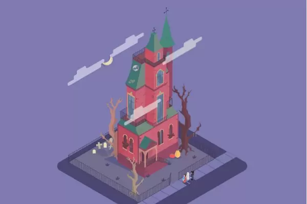
Анимированный зимний шар для сайта
19-декабря-2024, 23:34 25 0

Эта рождественская елка, снег и снегопад созданы с помощью HTML и CSS. Анимация сделана с помощью CSS и довольно проста. Я думаю, это отличный пример для тех, кто только изучает CSS-анимацию и видит, на что она способна. А также повод украсить свой проект на Новый год!!!
HTML
<div id="christmas">
  <div class="flake large f-1"></div>
  <div class="flake large f-2"></div>
  <div class="flake large f-3"></div>
  <div class="flake large f-4"></div>
  <div class="flake large f-5"></div>
  <div class="flake large f-6"></div>
  <div class="flake large f-7"></div>
  <div class="flake large f-8"></div>
  <div class="flake large f-9"></div>
  <div class="flake large f-10"></div>
  <div class="flake large f-11"></div>
  <div class="flake large f-12"></div>
  <div class="flake large f-13"></div>
  <div class="flake large f-14"></div>
  <div class="flake large f-15"></div>
  <div class="flake large f-16"></div>
  <div class="flake large f-17"></div>
  <div class="flake f-18"></div>
  <div class="flake f-19"></div>
  <div class="flake f-20"></div>
  <div class="flake f-21"></div>
  <div class="flake f-22"></div>
  <div class="flake f-23"></div>
  <div class="flake f-24"></div>
  <div class="flake f-25"></div>
  <div class="flake f-26"></div>
  <div class="flake f-27"></div>
  <div class="flake f-28"></div>
  <div class="flake f-29"></div>
  <div class="flake f-30"></div>
  <div class="flake f-31"></div>
  <div class="tree left">
    <div class="snow"></div>
  </div>
  <div class="tree right">
    <div class="snow"></div>
  </div>
  <div class="ground"></div>
</div>CSS(SCSS)
@import "compass/css3";

@mixin animation($animation) {
  -webkit-animation: $animation;
  -moz-animation: $animation;
  -ms-animation: $animation;
  -o-animation: $animation;
  animation: $animation;
}

@mixin animation-duration($duration) {
  -webkit-animation-duration: $duration;
  -moz-animation-duration: $duration;
  -ms-animation-duration: $duration;
  -o-animation-duration: $duration;
  animation-duration: $duration;
}

@mixin keyframes($name) {
  @-webkit-keyframes #{$name} {
    @content;
  }
  @-moz-keyframes #{$name} {
    @content;
  }
  @-ms-keyframes #{$name} {
    @content;
  }
  @keyframes #{$name} {
    @content;
  }
}

* {
  @include box-sizing(border-box);

  margin: 0;
  padding: 0;
}

body {
  background: #35a66f;
  text-align: center;
}

#christmas {
  background: #162a4e;

  @include border-radius(50%);
  @include background-image(linear-gradient(#0c1d38, #1a3158));

  position: relative;
  width: 182px;
  height: 182px;

  margin: 50px auto;
  overflow: hidden;

  /* iOS hack for border radius bleed with transforms */
  -webkit-mask-image: -webkit-radial-gradient(circle, white, black);

  .ground {
    @include border-top-right-radius(130px 40px);

    position: absolute;
    width: 133px;
    height: 61px;

    left: 0;
    bottom: 0;

    background: white;

    &:before {
      @include border-radius(50%);

      content: " ";
      position: absolute;

      width: 130px;
      height: 100px;

      top: 10px;
      right: -60px;

      background: white;
    }

    &:after {
      @include border-radius(50%);

      content: " ";
      position: absolute;

      width: 70px;
      height: 70px;

      top: 5px;
      right: -75px;

      background: white;
    }
  }

  .tree {
    position: absolute;

    width: 0;
    height: 0;

    border-style: solid;
    border-color: transparent transparent #23915b transparent;

    &:before {
      content: " ";
      position: absolute;

      width: 0;
      height: 0;

      border-style: solid;
      border-color: transparent transparent #23915b transparent;
    }

    &:after {
      content: " ";
      position: absolute;

      width: 0;
      height: 0;

      border-style: solid;
      border-color: transparent transparent #23915b transparent;
    }

    &.left {
      left: 28px;
      bottom: 78px;

      border-width: 0 18px 24px 18px;

      &:before {
        top: 10px;
        left: -21px;

        border-width: 0 21px 28px 21px;
      }

      &:after {
        top: 22px;
        left: -24px;

        border-width: 0 24px 32px 24px;
      }

      .snow {
        @include border-radius(50%);
        @include box-shadow((
          -2px 2px 0 0 white,
          2px 2px 0 0 white,
          -3px 3px 0 0 white,
          3px 3px 0 0 white,

          -12px 14px 0 0 white,
          -13px 17px 0 1px white,
          -16px 19px 0 0 white,

          -9px 16px 0 0 white,
          -5px 15px 0 2px white,
          -9px 13px 0 0 white,
          6px 15px 0 2px white,
          0 13px 0 1px white,

          11px 14px 0 1px white,
          13px 17px 0 1px white,
          15px 19px 0 0 white
        ));

        position: absolute;

        top: 1px;
        left: -3px;

        width: 6px;
        height: 6px;
        background: white;
        z-index: 1;

        &:after {
          @include border-radius(50%);
          @include box-shadow((
            -14px 14px 0 0 white,
            -15px 17px 0 1px white,
            -18px 19px 0 0 white,

            -9px 16px 0 0 white,
            -5px 15px 0 2px white,
            -9px 13px 0 0 white,
            6px 15px 0 2px white,
            0 13px 0 1px white,

            12px 17px 0 3px white,
            16px 17px 0 1px white,
            18px 19px 0 0 white,

            11px 20px 0 1px white,
            16px 20px 0 1px white,
            18px 22px 0 1px white,
            21px 25px 0 0 white,

            -2px 27px 0 1px white
          ));

          content: " ";
          position: absolute;

          top: 14px;
          left: 0px;

          width: 6px;
          height: 6px;
          background: white;
          z-index: 1;
        }
      }
    }

    &.right {
      left: 60px;
      bottom: 45px;

      border-width: 0 18px 24px 18px;

      &:before,
      &:after {
        display: none;
      }

      .snow {
        @include border-radius(50%);
        @include box-shadow((
          -1px 2px 0 0 white,
          -2px 3px 0 0 white,
          2px 2px 0 0 white,
          3px 3px 0 0 white,
          4px 4px 0 0 white,
          6px 6px 0 0 white,
          6px 15px 0 0 white,
          8px 16px 0 0 white,
          10px 16px 0 0 white,
          11px 16px 0 0 white,
          -5px 13px 0 0 white,
          -7px 12px 0 0 white
        ));
        position: absolute;

        top: 0;
        left: -3px;

        width: 6px;
        height: 6px;
        background: white;
      }
    }
  }

  .flake {
    @include animation(snow infinite linear 30s);

    position: absolute;

    width: 1px;
    height: 1px;

    background: white;

    &.large {
      @include border-radius(50%);

      width: 4px;
      height: 4px;
    }

    &.f-1 {
      @include animation-duration(20s);

      left: 15px;
      margin-top: 86px;
    }

    &.f-2 {
      @include animation-duration(23s);

      left: 32px;
      margin-top: 52px;
    }

    &.f-3 {
      @include animation-duration(32s);

      left: 64px;
      margin-top: 15px;
    }

    &.f-4 {
      @include animation-duration(21s);

      left: 69px;
      margin-top: 34px;
    }

    &.f-5 {
      @include animation-duration(24s);

      left: 70px;
      margin-top: 72px;
    }

    &.f-6 {
      @include animation-duration(16s);

      left: 90px;
      margin-top: 97px;
    }

    &.f-7 {
      @include animation-duration(34s);

      left: 102px;
      margin-top: 81px;
    }

    &.f-8 {
      @include animation-duration(37s);

      left: 102px;
      margin-top: 40px;
    }

    &.f-9 {
      @include animation-duration(35s);

      left: 108px;
      margin-top: 67px;
    }

    &.f-10 {
      @include animation-duration(23s);

      left: 90px;
      margin-top: 11px;
    }

    &.f-11 {
      @include animation-duration(27s);

      left: 126px;
      margin-top: 55px;
    }

    &.f-12 {
      @include animation-duration(29s);

      left: 131px;
      margin-top: 27px;
    }

    &.f-13 {
      @include animation-duration(24s);

      left: 128px;
      margin-top: 112px;
    }

    &.f-14 {
      @include animation-duration(23s);

      left: 146px;
      margin-top: 72px;
    }

    &.f-15 {
      @include animation-duration(19s);

      left: 147px;
      margin-top: 102px;
    }

    &.f-16 {
      @include animation-duration(22s);

      left: 166px;
      margin-top: 100px;
    }

    &.f-17 {
      @include animation-duration(18s);

      left: 177px;
      margin-top: 73px;
    }

    &.f-18 {
      @include animation-duration(26s);

      left: 22px;
      margin-top: 79px;
    }

    &.f-19 {
      @include animation-duration(20s);

      left: 31px;
      margin-top: 41px;
    }

    &.f-20 {
      @include animation-duration(19s);

      left: 38px;
      margin-top: 56px;
    }

    &.f-21 {
      @include animation-duration(31s);

      left: 56px;
      margin-top: 43px;
    }

    &.f-22 {
      @include animation-duration(20s);

      left: 89px;
      margin-top: 57px;
    }

    &.f-23 {
      @include animation-duration(18s);

      left: 90px;
      margin-top: 30px;
    }

    &.f-24 {
      @include animation-duration(28s);

      left: 100px;
      margin-top: 119px;
    }

    &.f-25 {
      @include animation-duration(29s);

      left: 114px;
      margin-top: 14px;
    }

    &.f-26 {
      @include animation-duration(25s);

      left: 127px;
      margin-top: 84px;
    }

    &.f-27 {
      @include animation-duration(26s);

      left: 134px;
      margin-top: 114px;
    }

    &.f-28 {
      @include animation-duration(34s);

      left: 145px;
      margin-top: 49px;
    }

    &.f-29 {
      @include animation-duration(29s);

      left: 148px;
      margin-top: 42px;
    }

    &.f-30 {
      @include animation-duration(23s);

      left: 157px;
      margin-top: 70px;
    }

    &.f-31 {
      @include animation-duration(18s);

      left: 165px;
      margin-top: 78px;
    }
  }
}

@include keyframes(snow) {
  0% {
    @include translateY(-110px);
  }

  100% {
    @include translateY(160px);
  }
}


Комментарии
all-
цитироватьТестируйте на 18 версии у кого есть возможность) если что подправим

 честно нет времени вообще. Ну вы еще ждёте?)) Я обновил, пробуйте
-
цитироватьТимофей, Мой взгляд, тогда у людей была Родина, было за что сражаться... и не важно какой был отдан приказ.... взять любой ценой... у меня два деда и две бабки были .. прошли всё это... они сделали это ради нас ... за нашу Родину!!! А наша Родина это наша Родина!


admin
27 мая 2025 21:56