


Хеллоуинский hover эффект при наведении на иконку
14-августа-2025, 21:12 20 0
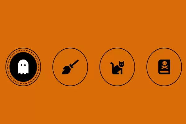
В продолжении темы Хеллоуина публикую найденный hover эффект при наведении указателя мыши на иконку. Иконки и цвета выполнены в стилях 🎃Хеллуина🎃. Кошки, призраки, ведьмина метла. Возможно кому и пригодится для оформления сайта или блога.
HTML
<head><script src="https://kit.fontawesome.com/369c45c001.js" crossorigin="anonymous"></script></head>

<body>
    <ul>
        <li><i class="fas fa-ghost"></i></li>
        <li><i class="fas fa-broom"></i></li>
        <li><i class="fas fa-cat"></i></li>
        <li><i class="fas fa-book-dead"></i></li>
    </ul>
</body>
CSS
body{
    height:100vh;
    display:flex;
    justify-content:center;
    align-items:center;
    margin:0;
    font-family:sans-serif;
    background-color:#D96C05
}

ul{
    padding:0;
    margin:0;
    display:flex;
}

ul li{
    list-style-type:none;
    width:120px;
    height:120px;
    margin:0 20px;
    border:2px solid black;
    border-radius:50%;
    transition:all 0.5s;
    position:relative;
    display:flex;
    align-items:center;
    justify-content:center;
}

ul li i{
    font-size:48px;
    color:black;
    transition:all 0.5s;
}

ul li:before{
    content:"";
    position:absolute;
    top:0;
    left:0;
    width:100%;
    height:100%;
    background-color:black;
    border-radius:50%;
    z-index:-1;
    transition:all 0.5s;
    opacity:0;
}

ul li:hover:before{
    opacity:1;
    transform:scale(0.8);
}

ul li i:hover{
    color:white;
}

ul li:after{
    content:"";
    position:absolute;
    top:0;
    left:0;
    width:100%;
    height:100%;
    background-color:transparent;
    border-radius:50%;
    z-index:-1;
    transition:all 0.5s;
    opacity:0;
    border:2px dashed black;
    box-sizing:border-box;
}

li:hover:after{
    opacity:1;
    animation:rotating 10s linear infinite;
}

@keyframes rotating{
    0%{transform:scale(0.92) rotate(0deg);}
    100%{transform:scale(0.92) rotate(360deg);}
}

Комментарии
all-
цитироватьТестируйте на 18 версии у кого есть возможность) если что подправим

 честно нет времени вообще. Ну вы еще ждёте?)) Я обновил, пробуйте
-
цитироватьТимофей, Мой взгляд, тогда у людей была Родина, было за что сражаться... и не важно какой был отдан приказ.... взять любой ценой... у меня два деда и две бабки были .. прошли всё это... они сделали это ради нас ... за нашу Родину!!! А наша Родина это наша Родина!


admin
27 мая 2025 21:56