


Ведьмин котел на CSS и JS к Хеллоуину
13-октября-2025, 23:38 33 0
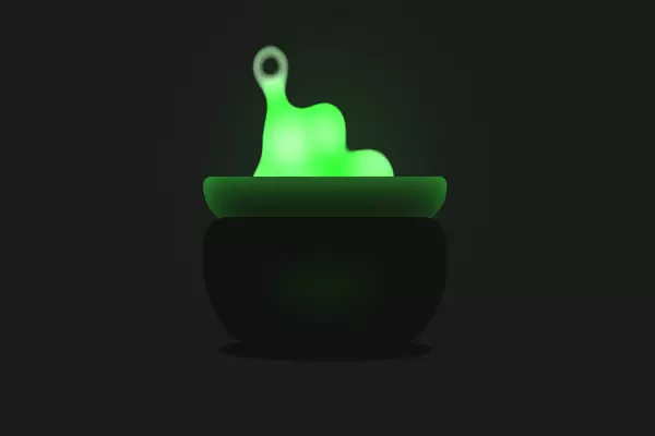
Красивое анимированное украшение для сайта к Хеллоуину в виде ведьминого котла где варится зелье. Зелье зелёного цвета, чем то похоже на слизь. Выполнена анимация при помощи CSS и Js. Код сниппета приведён ниже.
HTML
<div class="gooeys center">
  <canvas style="position:absolute;" id="canvas"</canvas>
</div>

<div class="glow center"></div>
<div class="shadow center"></div>
<div class="pot-top center"></div>
<div class="pot center"></div>


<svg>
  <defs>
    <filter id="filter">
      <feGaussianBlur in="SourceGraphic" stdDeviation="10" result="blur" />
      <feColorMatrix in="blur" mode="matrix" values="1 0 0 0 0  0 1 0 0 0  0 0 1 0 0  0 0 0 17 -10" result="filter" />
      <feBlend/>
    </filter>
  </defs>
</svg>
CSS
body {
  margin: 0;
  overflow: hidden;
  background-color: #1a1a1a;
}

.center {
  position: absolute;
  margin: auto;
  top: 0; bottom: 0;
  left: 0; right: 0;
}

canvas {
  position: absolute;
}

.gooeys {
    width: 100%;
    height: 100%;
    filter: url('#filter');
}

.bg {
    width: 390px;
    height: 390px;
    background-color: white;
    border-radius: 50%;
    transition: all 0.5s;
}

.pot {
  box-sizing: border-box;
  width: 250px;
  height: 120px;
  top: 100px;
  background: radial-gradient(#121, #111 45%);
  border-radius: 25px 25px 80px 80px;
}

.pot-top {
  box-sizing: border-box;
  width: 250px;
  height: 40px;
  background-color: #111;
  top: -50px;
  border-radius: 20px 20px 80px 80px;
  box-shadow: #4f4 0 10px 45px -17px inset;
}

.highlight{
  content: "";
  top: 20px; bottom: auto;
  background-color: rgba(68,255,68,0.3);
  width: 150px;
  height: 0;
  border-radius: 0 0 50% 50%;
  box-shadow: #4f4 0 0 35px 2px;
}

.glow {
  top: -100px;
  width: 0px;
  height: 0px;
  border-radius: 50%;
  color: rgba(68,255,68,0.4);
  box-shadow: 0 0 150px 50px;
  animation: glow 0.5s linear infinite alternate;
}

.shadow {
  top: 210px;
  width: 220px;
  height: 20px;
  background-color: #111;
  border-radius: 50%;
}

@keyframes glow {
  to{
    box-shadow: 0 0 120px 50px;
  }
}
JS
  canvas = document.getElementById("canvas");
  var context = canvas.getContext('2d');
  W = canvas.width = window.innerWidth;
  H = canvas.height = window.innerHeight;
  generatorStock = [];

  generatorStock.push(new particleGenerator( 2, 3, 30, 30));

  function randomInt(min, max) {
    return Math.floor(min + Math.random() * (max - min + 1));
  }

  function particle(vx, vy, size) {
    this.radius = randomInt(0, size);
    this.x = W/2;
    this.y = H/2;
    this.alpha = 1;
    this.vx = randomInt(-vx, vx);
    if(Math.random() < 0.1){
      this.vy = randomInt(-vy, -vy-3);
    }
    else{
      this.vy = randomInt(0, -vy);
    }
    this.lifetime = 100;
  }
  particle.prototype.update = function() {
    this.lifetime -= 2;
    this.x += this.vx;
    this.y += this.vy;

    if (this.lifetime < 20){
      this.radius -= 2;
    }

    context.beginPath();
    context.arc(this.x, this.y, this.radius, Math.PI * 2, false);
    context.fillStyle = "rgba(255,255,255,0.5)";
    context.strokeStyle = "#2f2";
    context.lineWidth = 10;
    context.fill();
    context.stroke();
    context.closePath();

  }

  function particleGenerator(vx, vy, size, maxParticles) {
    this.size = size;
    this.vx = vx;
    this.vy = vy;
    this.maxParticles = maxParticles;
    this.particles = [];
  }
  var freq = 0.5;
  particleGenerator.prototype.animate = function() {
    if (this.particles.length < this.maxParticles && Math.random() < freq)  {
      this.particles.push(new particle(this.vx, this.vy, this.size));
      if(this.particles.length == this.maxParticles/2){
        freq = 0.1;
      }
    }
    for (var i = 0; i < this.particles.length; i++) {
      p = this.particles[i];
      p.update();
      if (p.radius < 10) {
        this.particles[i] = new particle(this.vx, this.vy, this.size);
      }
    }
  }

  function update() {
    context.clearRect(0, 0, W, H);

    for (var i = 0; i < generatorStock.length; i++) {
      generatorStock[i].animate();
    }
    window.requestAnimationFrame(update);
  }

  update();

window.addEventListener('resize', function(e) {
    W = window.innerWidth;
    H = window.innerHeight;
  }, false);


Комментарии
all-
цитироватьТестируйте на 18 версии у кого есть возможность) если что подправим

 честно нет времени вообще. Ну вы еще ждёте?)) Я обновил, пробуйте
-
цитироватьТимофей, Мой взгляд, тогда у людей была Родина, было за что сражаться... и не важно какой был отдан приказ.... взять любой ценой... у меня два деда и две бабки были .. прошли всё это... они сделали это ради нас ... за нашу Родину!!! А наша Родина это наша Родина!


admin
27 мая 2025 21:56