


Прелоадер для сайта кот трансформер на html и css
2-сентября-2023, 22:25 86 0
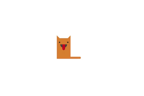
Предлагаю вашему вниманию прелоадер для сайта выполненный в виде анимированного кота трансформера. Эффект трансформации кота выполнен с применением html и css. Возможно кому и пригодится для оформления блога или сайта. Приведу код:
HTML
<script src="https://cdnjs.cloudflare.com/ajax/libs/jquery/3.3.1/jquery.min.js"></script>
<div id="preloader">
<div class="cat">
    <div class="ear right"></div>
    <div class="ear left"></div>
    <div class="eye left"></div>
    <div class="eye right"></div>
    <div class="mouth">
        <div class="tongue"></div>
    </div>
    <div class="tail"></div>
</div>
</div>
CSS
#preloader {
  background: #fff;
  position: fixed;
  z-index: 10001;
  height: 100%;
  width: 100%;
  overflow: hidden;
}

.cat {
    position: absolute;
    top: 50%;
    left: 50%;
    transform: translate(-50%, -50%);
    width: 100px;
    height: 100px;
    background: #d77d31;
    border-radius: 50%;
    animation: cat-transform 5s;
}

.cat .ear {
    content: "";
    position: absolute;
    width: 0;
    height: 0;
    border-style: solid;
}

.cat .ear.left {
    top: 20px;
    left: 20px;
    border-width: 20px 0 0 20px;
    border-color: transparent transparent transparent #d77d31;
    animation: ear-transform-left 5s;
}

.cat .ear.right {
    top: 20px;
    right: 20px;
    border-style: solid;
    border-width: 0 0 20px 20px;
    border-color: transparent transparent #d77d31 transparent;
    animation: ear-transform-right 5s;
}

.cat .eye {
    position: absolute;
    width: 20px;
    height: 20px;
    border-radius: 50%;
    background: #333;
    z-index: 5;
}

.cat .eye.left {
    top: 25px;
    left: 25px;
    animation: eye-transform-left 4s;
    animation-delay: 0.5s;
}

.cat .eye.right {
    top: 25px;
    right: 25px;
    animation: eye-transform-right 4s;
    animation-delay: 0.5s;
}

.cat .mouth {
    position: absolute;
    left: 25px;
    bottom: 15px;
    width: 50px;
    height: 25px;
    background: #444;
    border-radius: 0px 0px 25px 25px;
    animation: mouth-transform 4s;
    animation-delay: 0.5s;
}

.cat .mouth .tongue {
    position: absolute;
    left: 15px;
    width: 20px;
    height: 35px;
    border-radius: 0 0 20px 20px;
    background: #c10020;
    animation: tongue-bounce infinite;
    animation-duration: .25s;
}

.cat .tail {
    position: absolute;
    width: 0;
    height: 0;
    bottom: 0;
    left: 0;
    background: #d77d31;
    border-radius: 0 15px 15px 0;
    animation: tail-transform 4s;
    animation-delay: 0.5s;
}

@keyframes cat-transform {
    0% {
        width: 100px;
        height: 100px;
    }
    10% {
        width: 100px;
        height: 150px;
        border-radius: 0;
    }
    90% {
        width: 100px;
        height: 150px;
        border-radius: 0;
    }
    100% {
        width: 100px;
        height: 100px;
        border-radius: 50%;
    }
}

@keyframes mouth-transform {
    0% {
        bottom: 15px;
    }
    10% {
        bottom: 80px;
    }
    90% {
        bottom: 80px;
    }
    100% {
        bottom: 15px;
    }
}

@keyframes tongue-bounce {
    0% {
        height: 35px;
    }
    50% {
        height: 50px;
    }
    100% {
        height: 35px;
    }
}

@keyframes ear-transform-left {
    0% {
        top: 20px;
        left: 20px;
    }
    10% {
        top: -20px;
        left: 0px;
    }
    90% {
        top: -20px;
        left: 0px;
    }
    100% {
        top: 20px;
        left: 20px;
    }
}

@keyframes ear-transform-right {
    0% {
        top: 20px;
        right: 20px;
    }
    10% {
        top: -20px;
        right: 0px;
    }
    90% {
        top: -20px;
        right: 0px;
    }
    100% {
        top: 20px;
        right: 20px;
    }
}

@keyframes eye-transform-left {
    0% {
        width: 20px;
        height: 20px;
        left: 25px;
    }
    10% {
        width: 10px;
        height: 10px;
        left: 15px;
    }
    90% {
        width: 10px;
        height: 10px;
        left: 15px;
    }
    100% {
        width: 20px;
        height: 20px;
        left: 25px;
    }
}

@keyframes eye-transform-right {
    0% {
        width: 20px;
        height: 20px;
        right: 25px;
    }
    10% {
        width: 10px;
        height: 10px;
        right: 15px;
    }
    90% {
        width: 10px;
        height: 10px;
        right: 15px;
    }
    100% {
        width: 20px;
        height: 20px;
        right: 25px;
    }
}

@keyframes tail-transform {
    0% {
        width: 0;
        height: 0;
    }
    10% {
        width: 175px;
        height: 15px;
    }
    90% {
        width: 175px;
        height: 15px;
    }
    100% {
        width: 0;
        height: 0;
    }
}
JS
$(window).on("load",function(){
$("#preloader").delay(5000).fadeOut("slow");
});


Комментарии
all-
цитироватьТестируйте на 18 версии у кого есть возможность) если что подправим

 честно нет времени вообще. Ну вы еще ждёте?)) Я обновил, пробуйте
-
цитироватьТимофей, Мой взгляд, тогда у людей была Родина, было за что сражаться... и не важно какой был отдан приказ.... взять любой ценой... у меня два деда и две бабки были .. прошли всё это... они сделали это ради нас ... за нашу Родину!!! А наша Родина это наша Родина!


admin
27 мая 2025 21:56