


Анимация размытого текста
14-сентября-2025, 14:43 345 0
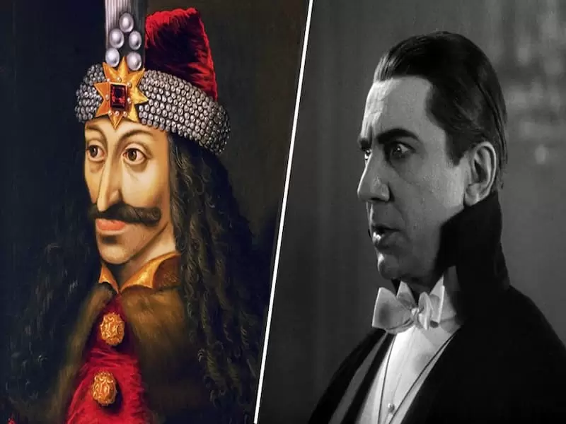
Вот причудливый эффект текстовой анимации с использованием lettering.js , текст загружается как размытое месиво , которое действительно трудно читать, затем текст фокусируются до читаемого вида, а после исчезает, чтобы загрузить следующую строку. Данную анимация размытого текста можно использовать для оформления сайта к Хэллоуину или блогу посвящённому ужастикам .
HTML
<div class="intro-text" id="intro-text">
        <h2>INTRO TEXT AWESOMENESS</h2>
        <h2>Made Possible With</h2>
        <h2>CSS ANIMATION</h2>
        <h2>& A TINY BIT OF</h2>
        <h2>jаvascript</h2>
        <h2>TO INITIATE THE</h2>
        <h2>jQuery LETTERING.js PLUGIN</h2>
        <h2>REFRESH TO SEE IT AGAIN...</h2>
      </div>
CSS
@import url(https://fonts.googleapis.com/css?family=Special+Elite);
body{background:#000;font-family: 'Special Elite', cursive;}
.intro-text h2 {
  font-size: 70px;
  font-weight: 200;
  width: 100%;
  overflow: hidden;
  text-transform: uppercase;
  padding: 0;
  margin: 0;
  position: absolute;
  top: 0;
  left: 0;
  letter-spacing: 14px;
  text-align: center;
  opacity: 0;
}

.intro-text h2,
.intro-text h2 > span {
  height: 100%;
  display: -webkit-box;
  display: -moz-box;
  display: -ms-flexbox;
  display: -webkit-flex;
  display: flex;
  -webkit-flex-direction: row;
  -ms-flex-direction: row;
  flex-direction: row;
  -webkit-box-pack: center;
  -moz-box-pack: center;
  -webkit-justify-content: center;
  -ms-flex-pack: center;
  justify-content: center;
  -webkit-box-align: center;
  -moz-box-align: center;
  -webkit-align-items: center;
  -ms-flex-align: center;
  align-items: center;
}

.intro-text h2 > span {
  margin: 0 15px;
}

.intro-text h2 > span > span {
  display: inline-block;
  -webkit-perspective: 1000px;
  -moz-perspective: 1000px;
  perspective: 1000px;
  -webkit-transform-origin: 50% 50%;
  -moz-transform-origin: 50% 50%;
  transform-origin: 50% 50%;
}

.intro-text h2 > span > span > span {
  display: inline-block;
  color: hsla(0,0%,0%,0);
  -webkit-transform-style: preserve-3d;
  -moz-transform-style: preserve-3d;
  transform-style: preserve-3d;
  -webkit-transform: translate3d(0,0,0);
  -moz-transform: translate3d(0,0,0);
  transform: translate3d(0,0,0);
  -webkit-animation: TextSequence 5.2s linear forwards;
  -moz-animation: TextSequence 5.2s linear forwards;
  animation: TextSequence 5.2s linear forwards;
}

.intro-text h2:nth-child(2) > span > span > span {
  -webkit-animation-delay: 5s;
  -moz-animation-delay: 5s;
  animation-delay: 5s;
}

.intro-text h2:nth-child(3) > span > span > span {
  -webkit-animation-delay: 10s;
  -moz-animation-delay: 10s;
  animation-delay: 10s;
}

.intro-text h2:nth-child(4) > span > span > span {
  -webkit-animation-delay: 15s;
  -moz-animation-delay: 15s;
  animation-delay: 15s;
}

.intro-text h2:nth-child(5) > span > span > span {
  font-size: 150px;
  -webkit-animation-delay: 21s;
  -moz-animation-delay: 21s;
  animation-delay: 21s;
  -webkit-animation-duration: 8s;
  -moz-animation-duration: 8s;
  animation-duration: 8s;
}

.intro-text h2:nth-child(6) > span > span > span {
  -webkit-animation-delay: 30s;
  -moz-animation-delay: 30s;
  animation-delay: 30s;
}

.intro-text h2:nth-child(7) > span > span > span {
  -webkit-animation-delay: 34s;
  -moz-animation-delay: 34s;
  animation-delay: 34s;
}

@-webkit-keyframes TextSequence {
  0% {
    text-shadow: 0 0 50px #fff;
    letter-spacing: 80px;
    opacity: 0;
    -webkit-transform: rotateY(-90deg);
  }
  50% {
    text-shadow: 0 0 1px #fff;
    letter-spacing: 14px;
    opacity: 0.8;
    -webkit-transform: rotateY(0deg);
  }
  85% {
    text-shadow: 0 0 1px #fff;
    opacity: 0.8;
    -webkit-transform: rotateY(0deg) translateZ(100px);
  }
  100% {
    text-shadow: 0 0 10px #fff;
    opacity: 0;
    -webkit-transform: translateZ(130px);
    pointer-events: none;
  }
}

@-moz-keyframes TextSequence {
  0% {
    text-shadow: 0 0 50px #fff;
    letter-spacing: 80px;
    opacity: 0.2;
    -moz-transform: rotateY(-90deg);
  }
  50% {
    text-shadow: 0 0 1px #fff;
    letter-spacing: 14px;
    opacity: 0.8;
    -moz-transform: rotateY(0deg);
  }
  85% {
    text-shadow: 0 0 1px #fff;
    opacity: 0.8;
    -moz-transform: rotateY(0deg) translateZ(100px);
  }
  100% {
    text-shadow: 0 0 10px #fff;
    opacity: 0;
    -moz-transform: translateZ(130px);
    pointer-events: none;
  }
}

@keyframes TextSequence {
  0% {
    text-shadow: 0 0 50px #fff;
    letter-spacing: 80px;
    opacity: 0.2;
    transform: rotateY(-90deg);
  }
  50% {
    text-shadow: 0 0 1px #fff;
    letter-spacing: 14px;
    opacity: 0.8;
    transform: rotateY(0deg);
  }
  85% {
    text-shadow: 0 0 1px #fff;
    opacity: 0.8;
    transform: rotateY(0deg) translateZ(100px);
  }
  100% {
    text-shadow: 0 0 10px #fff;
    opacity: 0;
    transform: translateZ(130px);
    pointer-events: none;
  }
}

.intro-text h2:nth-child(8) > span > span > span {
  font-size: 30px;
  -webkit-animation: FadeIn 4s linear 40s forwards;
  -moz-animation: FadeIn 4s linear 40s forwards;
  animation: FadeIn 4s linear 40s forwards;
}

@-webkit-keyframes FadeIn {
  0% {
    opacity: 0;
    text-shadow: 0 0 50px #fff;
  }
  100% {
    opacity: 0.8;
    text-shadow: 0 0 1px #fff;
  }
}

@-moz-keyframes FadeIn {
  0% {
    opacity: 0;
    text-shadow: 0 0 50px #fff;
  }
  100% {
    opacity: 0.8;
    text-shadow: 0 0 1px #fff;
  }
}

@keyframes FadeIn {
  0% {
    opacity: 0;


    text-shadow: 0 0 50px #fff;
  }
  100% {
    opacity: 0.8;
    text-shadow: 0 0 1px #fff;
  }
}

/* Bold Text */
.intro-text h2:first-child .word3,
.intro-text h2:nth-child(2) .word2,
.intro-text h2:nth-child(4) .word2 {
  font-weight: 600;
}
JS
$(document).ready(function() {
$("#intro-text > h2").css('opacity',1).lettering('words').children("span").lettering().children("span").lettering();
})

Комментарии
all-
цитироватьТестируйте на 18 версии у кого есть возможность) если что подправим

 честно нет времени вообще. Ну вы еще ждёте?)) Я обновил, пробуйте
-
цитироватьТимофей, Мой взгляд, тогда у людей была Родина, было за что сражаться... и не важно какой был отдан приказ.... взять любой ценой... у меня два деда и две бабки были .. прошли всё это... они сделали это ради нас ... за нашу Родину!!! А наша Родина это наша Родина!


admin
27 мая 2025 21:56