


Анимированный котик на html и css
26-августа-2023, 19:10 127 0
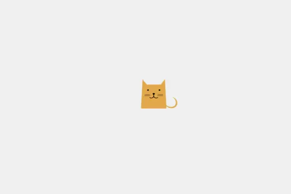
Милый анимированный котик может украсить ваш блог или сайт своим присутствием. Котик будем моргать глазками каждому зашедшему посетителю и станет дополнением для вашей тематической станицы. Котик сделан при помощи HTML и CSS. Для того , чтобы завести милого котейку у себя на сайте , нужно просто скопировать ниже приведённый код к себе на страничку в нужное место. Стили разместить отдельно в подключенном файле стилей или на той же странице с тегами <style>.
HTML
<div id="catblock">
<div class="cat body bodySlant earsBasic">
  <div class="face"></div>
  <div class="features"></div>
</div>
</div>
CSS
body {
    background-color: #f1f1f1;
}

#catblock {
    height: 100%;
    display: flex;
    align-items: center;
    justify-content: center;
}

.body {
    width: 90px;
    height: 100px;
}

.body, .body:before, .body:after {
    position: absolute;
}

.body:before, .body:after {
    content: '';
}

.face, .face:before, .face:after,
.features,
.features:before,
.features:after {
    position: absolute;
}

.face:before, .face:after,
.features:before,
.features:after {
    content: '';
}

.bodySlant {
    background-color: #e6ac4c;
    border-radius: 4px;
    transform-origin: 50% 100%;
    transform: perspective(300px) rotateX(20deg);
}

.earsBasic:before, .earsBasic:after {
    width: 0;
    height: 0;
    top: -25px;
    border-top: 28px solid transparent;
    border-bottom: 20px solid transparent;
}

.earsBasic:before {
    border-left: 20px solid #e6ac4c;
    left: 0;
}

.earsBasic:after {
    border-right: 20px solid #e6ac4c;
    right: 0;
}

.cat .face {
    top: 22px;
    left: 20px;
    width: 6px;
    height: 6px;
    background-color: #000;
    border-radius: 50%;
    box-shadow: 44px 0 #000;
    animation: blink 8s infinite linear;
}

.cat .face:before, .cat .face:after {
    top: 14px;
    left: 6px;
    z-index: 5;
    width: 16px;
    height: 20px;
    border-radius: 50% / 40%;
    border-right: 2px solid #000;
    border-bottom: 2px solid #000;
    border-left: 2px solid transparent;
    border-top: 2px solid transparent;
    box-shadow: 0px 0px #000;
}

.cat .face:after {
    left: 24px;
    transform: rotateY(180deg);
}

.cat .features {
    top: 44px;
    left: 11px;
    width: 20px;
    height: 1px;
    background-color: #000;
    box-shadow: 0 5px #000, 48px 0 #000, 48px 5px #000;
}

.cat .features:after {
    left: 30px;
    top: -6px;
    width: 6px;
    height: 6px;
    background-color: #000;
    border-radius: 50%;
    box-shadow: 2px 0 #000, 1px 1px #000;
    animation: yawn 8s infinite linear;
}

.cat .features:before {
    top: 10px;
    left: 74px;
    width: 40px;
    height: 40px;
    border-radius: 50%;
    border: 5px solid #e6ac4c;
    border-left: 0;
    border-top: 0;
}

@keyframes blink {
    32% {
        height: 6px;
    }
    38% {
        height: 1px;
    }
    42% {
        height: 1px;
    }
    48% {
        height: 6px;
    }
}

@keyframes yawn {
    32% {
        box-shadow: 2px 0 #000, 1px 1px #000, 0px 16px transparent, 2px 16px transparent, 1px 18px transparent;
    }
    35% {
        box-shadow: 2px 0 #000, 1px 1px #000, 0px 16px #650000, 2px 16px #650000, 1px 18px transparent;
    }
    38% {
        box-shadow: 2px 0 #000, 1px 1px #000, 0px 16px #650000, 2px 16px #650000, 1px 18px #650000;
    }
    42% {
        box-shadow: 2px 0 #000, 1px 1px #000, 0px 16px #650000, 2px 16px #650000, 1px 18px #650000;
    }
    45% {
        box-shadow: 2px 0 #000, 1px 1px #000, 0px 16px #650000, 2px 16px #650000, 1px 18px transparent;
    }
    48% {
        box-shadow: 2px 0 #000, 1px 1px #000, 0px 16px transparent, 2px 16px transparent, 1px 18px transparent;
    }
}


Комментарии
all-
цитироватьТестируйте на 18 версии у кого есть возможность) если что подправим

 честно нет времени вообще. Ну вы еще ждёте?)) Я обновил, пробуйте
-
цитироватьТимофей, Мой взгляд, тогда у людей была Родина, было за что сражаться... и не важно какой был отдан приказ.... взять любой ценой... у меня два деда и две бабки были .. прошли всё это... они сделали это ради нас ... за нашу Родину!!! А наша Родина это наша Родина!


admin
27 мая 2025 21:56